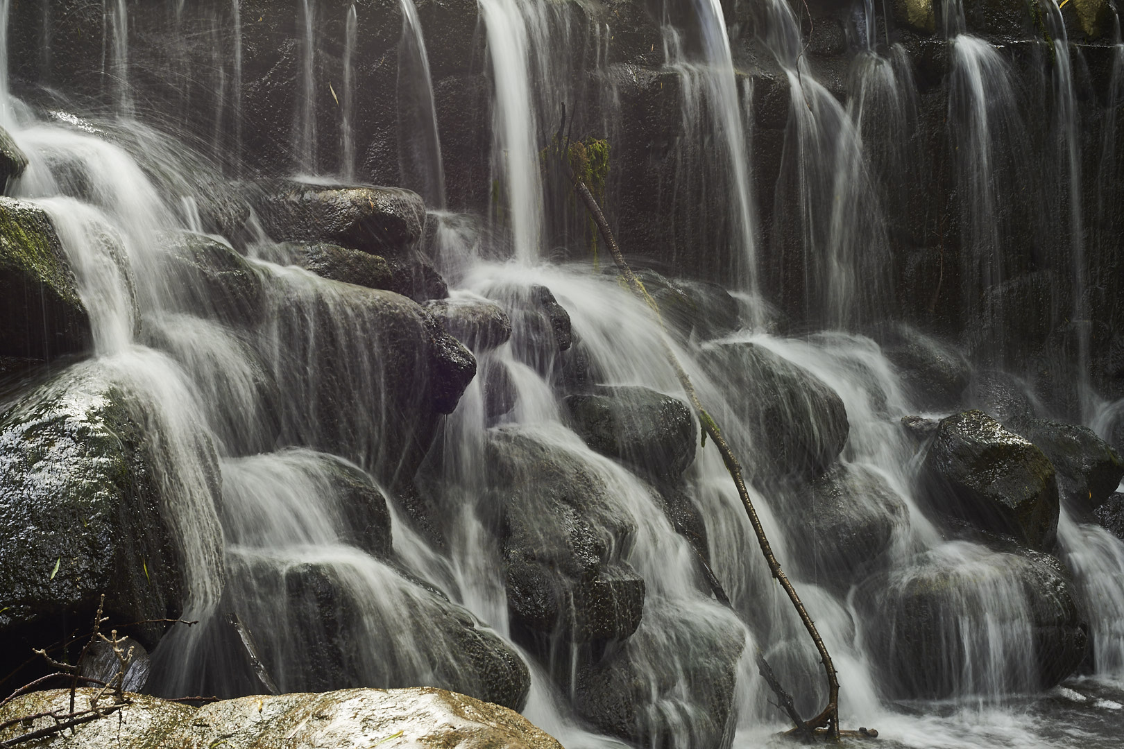
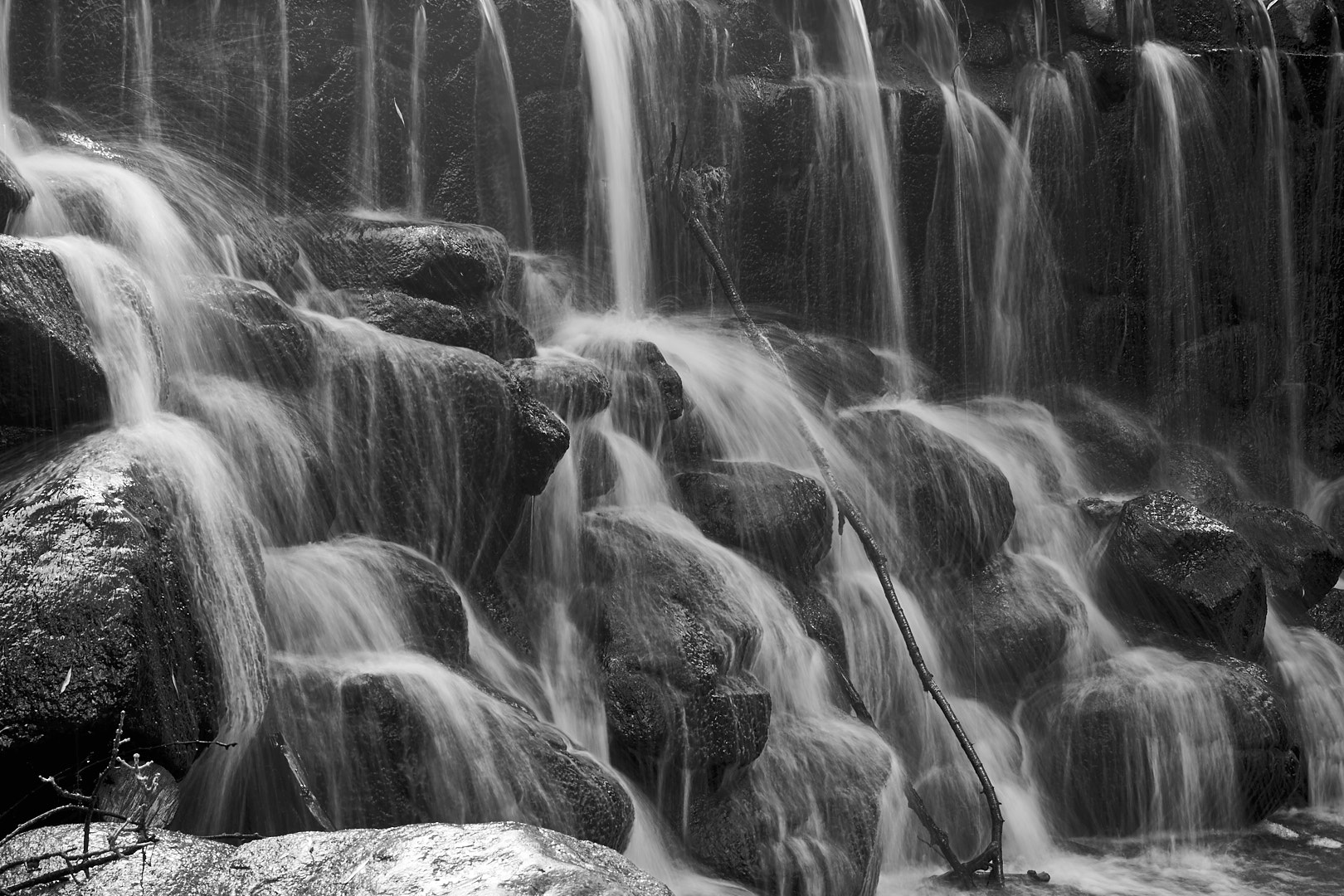
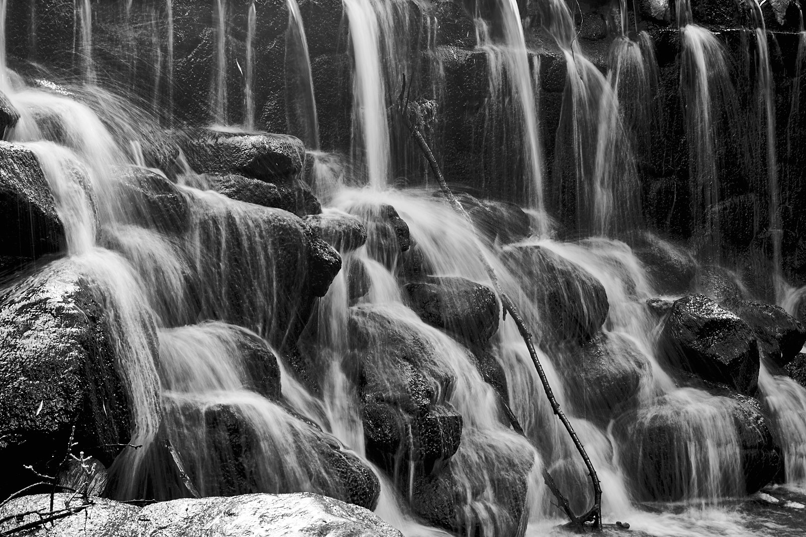
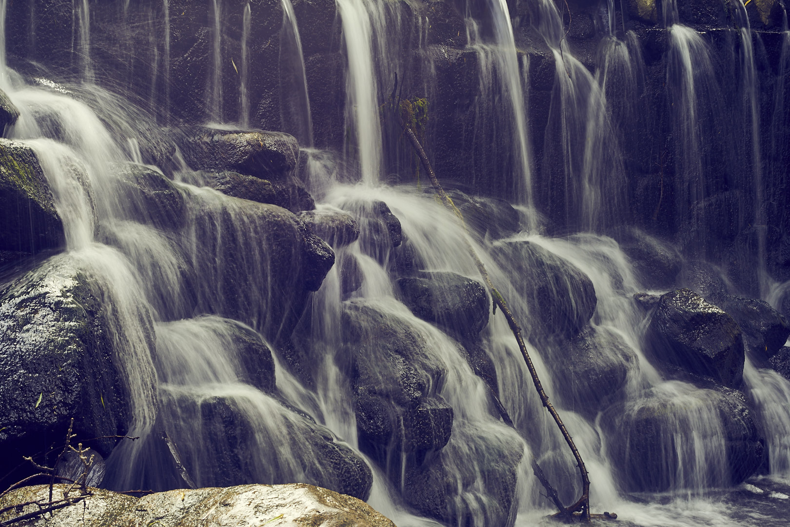
In this Four Edit Friday we look at a photograph of a waterfall, and make 2 color and two black and while edits.
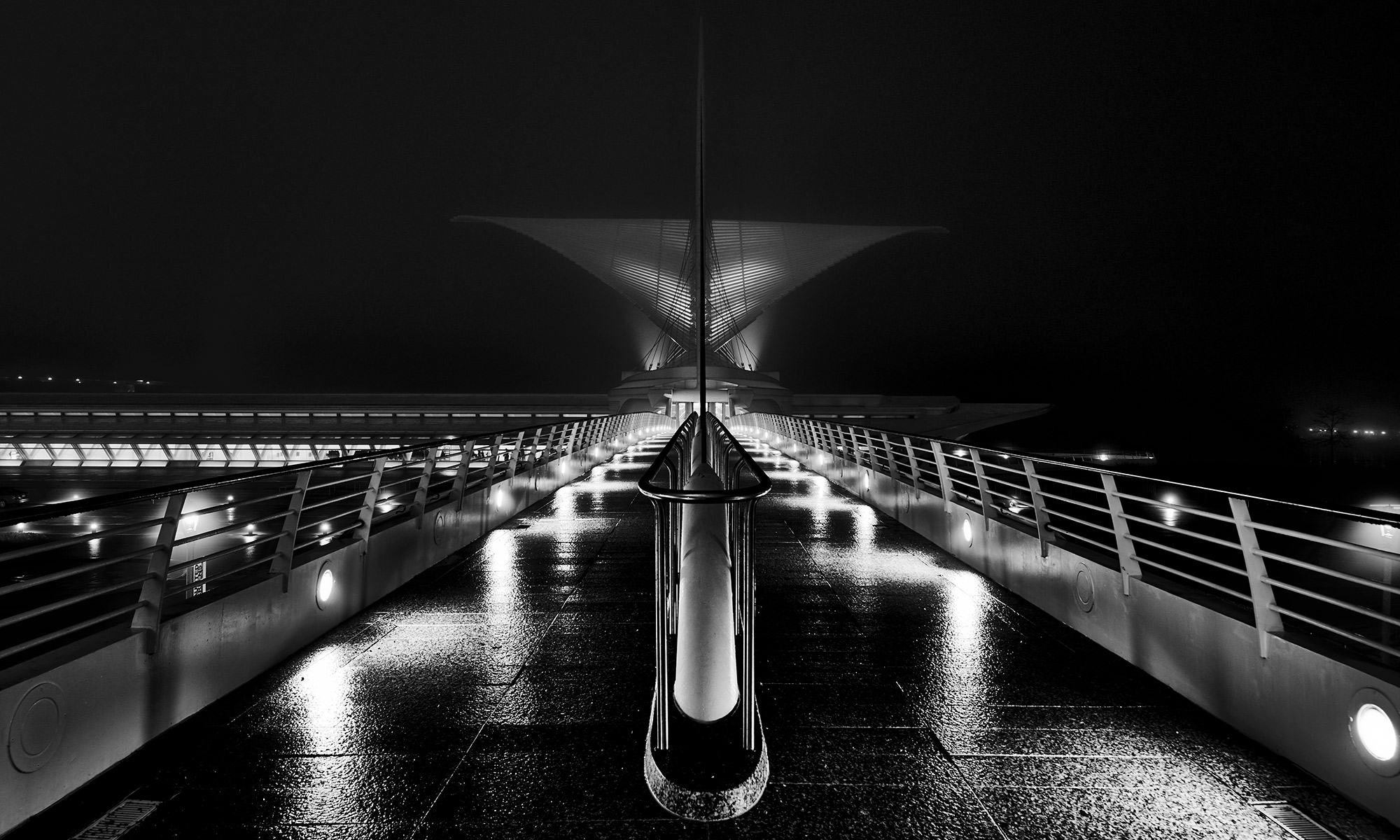
Get Out And Make Something Beautiful
In this Four Edit Friday we look at a photograph of a waterfall, and make 2 color and two black and while edits.
This is an idea for a series of videos doing 4 edits of the same photograph.
Here are the final photos:
Which do you like, or how would you have edited it differently? Please leave a comment below.
Do you like this format for videos? Would you like to see more?
Looking at a photograph from a recent trip, I realized something. The photograph shows the Lake Michigan shoreline, and looks very peaceful. As is often the case, looks can be deceiving, as the waves were crashing to the point that I was getting splashed regularly standing 10-15 feet above the water. But a 2 minute exposure smoothed the waves to the point that they look like little more than haze around the base of the cliffs. As big as any wave was, it made only a faint impression, that over time averaged into something serene and beautiful.

In life, we are often battered by the waves of adversity. Problems at work, school, or home can seem insurmountable at the time, but we usually find that with the passage of time the insurmountable becomes a distant memory, and usually even weaves into the beauty that is our life. Just like the photograph, things that look huge in the moment look small and dim in the context of our lives. Looking at your problems in the light of this longer time frame can reduce stress and get you through the challenges of life.
So if you are faced with problems, or are looking at taking a risky step, look at it in the context of this year, or better yet this decade, or your lifetime, and you will realize that problems are almost never as big as they seem, and that risks that won’t kill you.
But as I was thinking about the first part of this, another observation hit me. It may seem contradictory, but I think they are complimentary, and work well together.
In today’s celebrity culture, it is easy to compare ourselves to TV and movies stars or the latest social media sensation, or even the most popular kid a school or someone at work. Their lives looks so perfect that we can never compete. Just remember that we are seeing photographs separated from reality by plenty of time and distance (and probably some retouching.) The waves are there, too. Don’t ever think that someone famous has it so perfect that your life can never compare. They have struggles too, but the distance masks that. Don’t punish yourself by trying to match something even they can’t.
After using Phase One’s Capture One for most of my photo editing, I have come up with a few tips to help get the best results. Hopefully these can help you, too.
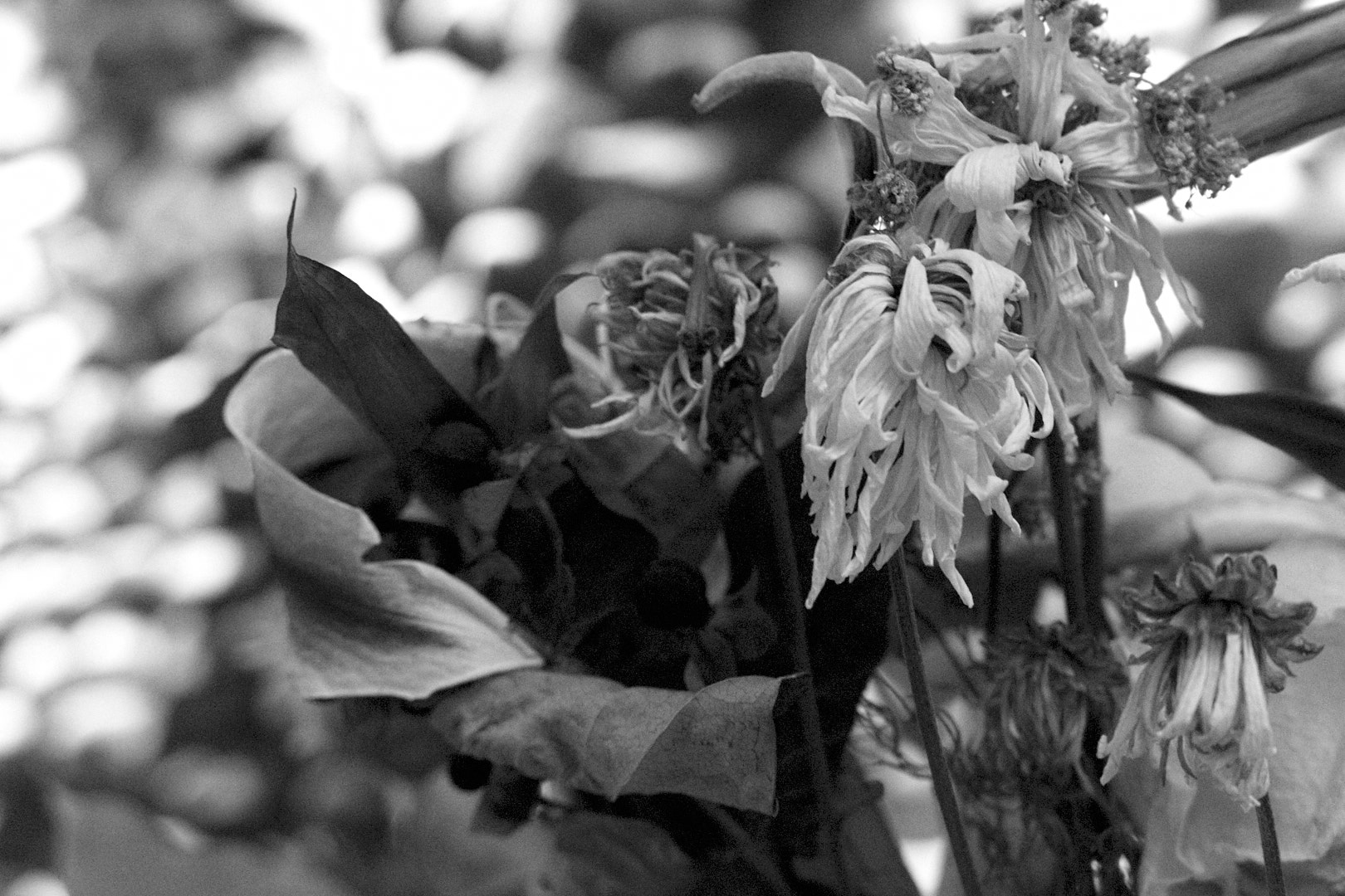
1: Setting Black and White points.
If you use Lightroom, or watch any tutorials, you have probably seen the tip to hold down the Alt/Option key while setting the white and black points. You can use the Exposure warnings in C1 the same way, but make sure that Shadow Warnings are enabled (Preferences > Exposure > “Enable Shadow Warnings” checkbox”).
I normally don’t use the warnings much, I start by setting the points to edge of the histogram, and adjusting by sight from there. When you are setting the black and white points, don’t be afraid to have some areas that are in warnings. The sun, specular highlights, and lights will often be entirely washed out, and will look wrong if they aren’t, and some shadow areas should probably wind up black.
2: Dodging and Burning.
When using local adjustments to selectively lighten dark areas, or darken light areas, using highlight or shadow recovery can render more natural and pleasing results than using the exposure slider.
If the section is too far into the mid tones, or it does not work for some other reason, you can use the HDR tools to soften the effect.
3: Overdoing Effects
Ever need just a little more shadow recovery or something? Applying a selective adjustment mask to the whole picture allows you to add more of many maxed-out adjustments.
4: Customizing Your Tools.
This one isn’t really a secret, but C1 lets you create custom tool tabs. I have one that contains Base Characteristics, Rotation & Flip, Exposure, Levels, White Balance, High Dynamic Range, Clarity, Sharpening, and Black & White. I spend 90+% of my time in the browser tab and my custom one.
5: White balance in Black & White?
Yes! Adjusting the white balance in B&W photos can drastically alter the look. The white balance is applied before the B&W conversion, so adjusting it can act a lot like the sliders in the B&W tool to adjust the levels of individual colors. It is less predictable, but can sometimes make adjustments that are difficult with just the color sliders. Setting the white balance can also add separation for some colors, so I would recommend setting white balance before you do the B&W conversion in any case.
6: Try some non-conventional adjustments
Highlight recovery not looking quite right? Try lowering overall exposure, then using shadow recovery to lighten the shadows. There are a number of maybe counterintuitive things like this to try. It can seem weird, but like they say in audio “if is sounds (looks) right, it is right.”
7: Smoothing Colors
The skin tone color editor tool has additional tools to smooth out colors, however, the tool is by no means limited to skin tones. You can use it to smooth any tones in the image, and since it is available as a Local Adjustment, it can be applied to multiple tones in an image.
8: Enlarge tools
Some tools, like the Color Balance tool, can be difficult to use at the size it is on tool palate. If you click and drag the top of the tool off the palate, it becomes a floating window, and can be resized. Just drag it back onto the palate to dock it again.

9: The many ways to adjust contrast
There are several ways to adjust contrast in an image, including the contrast slider, Levels tool, High Dynamic Range tools, curve tool, and even the Color Balance tool. Play around with them all, and learn their strengths and weaknesses.
10: Selective saturation adjustments.
One of my biggest uses for the Color Editor is to tame the saturation of greens in an outdoor image. To do this, I increase the overall image saturation, then bring the greens down. You could also select the greens, invert the selection, and increase the contrast.
One thing to be aware of is that the overall saturation is applied before the Local Adjustments, so if you desaturated the image, you may not be able to add saturation back in.
I hope these give you some ideas to improve your editing.
Do you have any tips or tricks? Please leave them in the comments.
Over the last 240 or so years, many thousands of young men and women have decided that there was something out there that mattered more than themselves. More than their hopes and dreams, more than life itself. They left behind home, family, friends, and the familiar to fight for their country. From the American Revolution, The War of 1812, the American Civil War, two world wars, Korea, Vietnam, Operation Desert Storm, through the current global war on terror, and countless smaller operations throughout the world, they have fought and died so that Americans and others can enjoy the freedoms we have.
They left behind mothers and fathers, brothers and sisters, husbands, wives, girlfriends, boyfriends and children in the hope that they and their loved ones could have a better country and World to live in. Although many of them came home to enjoy that life, many others gave the ultimate sacrifice for us. They forever rest in cemeteries throughout the world, or in the fields or seas where they fell.
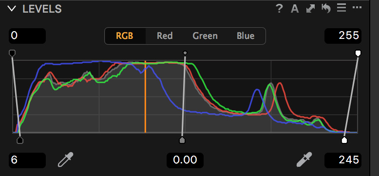
My family has been blessed, the nearest relative I have lost is one of my grandfather’s cousins, Harry Peter Holdmann, killed in action in the Second World War, 36 years before I was born. I thank the Lord that we can remember the service of many other family members and friends on November 11th, instead of today. But that thankfulness is tinged with sadness, knowing that many families have lost loved ones.
So this weekend, take a few minutes away from the barbecues and family gatherings to remember those who can’t be here, and to be grateful to them, and those who loved them.
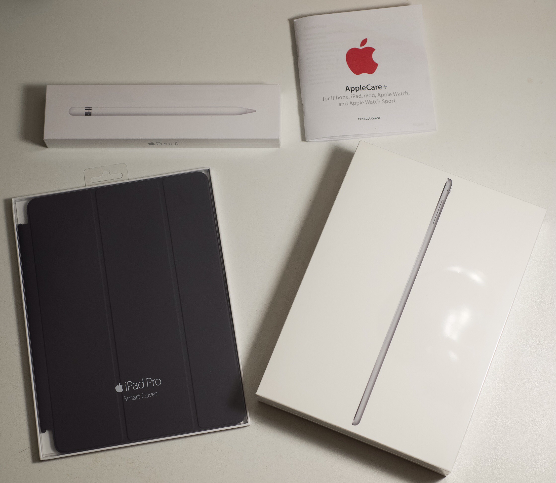
My days of being an iPad hold out are over. I picked up an iPad Pro 9.7″ an hour or two after they became available. I also picked up the Pencil, but missed the last keyboard by minutes (maybe seconds).
I have some experience with my wife’s iPad Mini, but not owning my own, so keep that in mind. Also, any too big, too small or too anything else are for me, maybe not for you.
Why now?
I was looking at picking up an iPad a couple years ago, and decided that they were too much of a consumption device, and not enough of a creative one, and ended up with a MacBook Pro. I believe that has changed over the last couple years, with the continued introduction and perfecting of creative apps. Adobe has released several great apps, as have many other developers. Apple built on this with the release of the Pencil, which is a very solid product.
Adobe has a mobile version of Lightroom, and a couple Photoshop based apps, which make for a powerful option for editing on the go, which is increasingly important to feed the beast that is social media.
The other creative field the iPad has made great inroads in is music, with Garage Band, a couple other DAWs, and may instruments. I have played with Garage Band, Propellerheads Figure, iMaschine, and some others on my iPhone, which is fun, but rather cramped. On the iPad, they are much more useful. While I am not a great musician, I expect to be able to use these tools to create soundtracks for timelapses, etc. The music for this was created with GB on my Mac, and while it is not going to win any awards, I think it adds to the video:
https://m.youtube.com/watch?v=m9HIazbbwCA
Do I see the iPad replacing my Mac? No. Well, not completely. I do most of my RAW processing in Capture One, and at this point there is no mobile option for that. Lightroom mobile is also an option, but that is designed more to augment the desktop version than to replace it. RAW images cannot be directly imported into LRM, and the ones imported into the desktop and synced are stored as “Smart Previews” and the edits synced back to the desktop, rather than as real RAW files.
What I can potentially see is moving to a desktop computer, due to the increased storage and processing power, and letting the iPad take over mobile duties.
It has been working quite well for writing this, reading e-books, etc. and I can certainly see it continuing to take over desktop duties.
Do I regret not getting it earlier? Yes and no. In a world with all the money I could need, I would have bought it earlier. However, I think the money has been better spent on my D610, MacBook, etc, and there is not anything I would change taking that into consideration.
Thoughts on the Pro Specifically
So why the iPad Pro 9.7, and what do I think of it?
I liked the look of the original iPad Pro, especially the Pencil. However, the size was too big for me. I figured that the Pencil, and some of the other tech, would soon come to the smaller profile devices, and I kept an eye on the rumor mill, and since late last year it has been widely rumored that this was correct. Some people have said that it would cannibalize business from the larger iPad Pro, and while there may be some of that, I think that people are going to buy the size that works for them, and buy other styluses, etc if the Pencil is not available. Also, the price is not that far different, especially when you subtract out the cost of production, and this may get people who already own the 9.7″ devices to upgrade.
When the announcement came out, there were two big things the rumor mill hadn’t gotten: the 256 Gig model, and the TrueTone screen. Personally, when the original Pro came out, I was surprised they had not released at least a 256 Gig, or even a 512, so as far as I was concerned, it only made sense to do it now.
The True Tone display is great, it makes the screen much easier on the eyes, especially after dark. The only concern I have is photo editing, I will have to do some testing to see if it throws me off setting color balance.
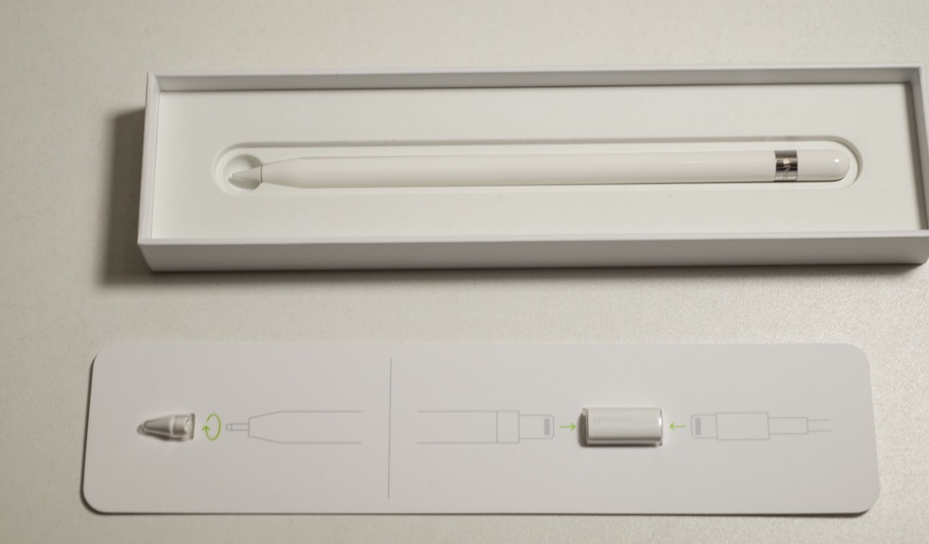
The pencil is pretty much what I expected, no surprises good or bad. The one bad thing is that since there is no way to store the pencil in or on the iPad, it is easy to lose track of. There are some aftermarket options which I may end up looking into. The pressure and tilt sensitivity work as expected, but the experience can vary greatly depending on the app you are using.
So has Apple gone back on Steve Jobs saying that your finger is the only stylus you need? I don’t really think so. The iPad experience is still very much optimized for fingertip use, and the Pencil probably detracts from user experience when doing most tasks. If you are not planning on drawing or doing photo retouching, the Pencil is probably not a good investment, but if those things interest you, it works quite well.
The Apple Store did not have the keyboard, but the had some demos, so I got to play a little bit, and it seemed alright, but a little tight, which is only to be expected. The key movement is also very short, which may be a little hard to work with. I am planning to get one once they are in stock, and maybe I can give some more feedback later.
3D Touch, or lack thereof. I have heard two reasons for the lack of 3D Touch, either supply chain issues, or not being compatible with the Pencil. To me it is too bad it doesn’t have 3D Touch, but not a big deal. There are some good applications with it, like after touch in Garage Band, but so far I don’t think it is really making that big a difference.
The speakers are definitely good. They lose it a little as you get to the top of the volume range, but most speakers are going to do that.
Cameras: the one on the back is the same as the camera in the iPhone 6S, and is a pretty solid camera for a phone/tablet. Apple finally upgraded the “selfie” camera from 1.2 to 5 megapixel, but is still only 720P video. Hopefully they are able to update it for 1080P in a future update, which would be great for video blogging or live streaming on Periscope or the like. With th popularity of those applications, and selfies, I find it a little odd that this hasn’t been done long ago.
Split-screen multitasking: not really iPad Pro specific, but still fairly new. For the most part I find it very useful, especially when writing. I can be typing in the WordPress app, and have Twitter or a browser open next to it, or be reading, and taking notes along side. However, not all apps support this feature, which can be a serious limitation. For instance, the Bible app I use on my MacBook and iPhone does not, so it is more difficult either taking notes on what I am reading, or using it for reference while writing something.
The other fairly serious limitation is that you cannot have the same app in both windows, for instance to compare documents, or have two browsers open. The brain browser one can be worked around by downloading chrome or Firefox, and running different browsers.
All in all, I think it was a good purchase, and look forward to using it more.
What are your must-have apps? Let us know in the comments.
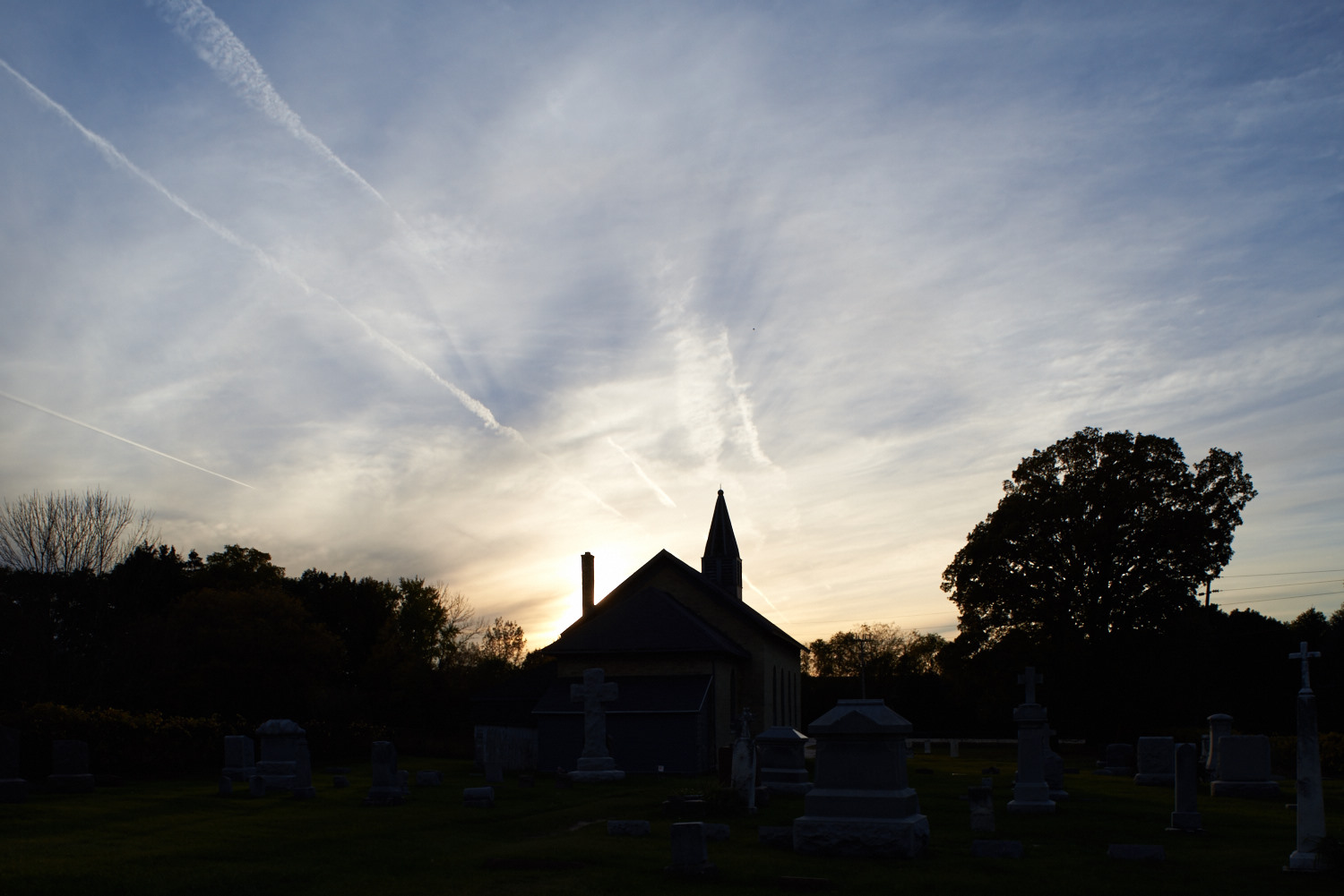
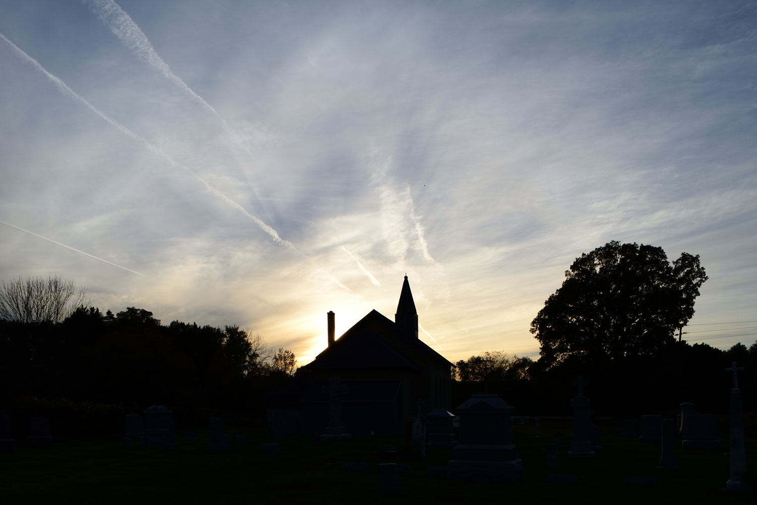
The other night I took a little detour on the way home to photograph a small church near my office.
It was sunset, and the church was silhouetted against an interesting sky. The photo below is default off the camera. Capture One makes a couple changes by default, so it’s a little different than a camera JPEG would be. This is pretty much the photo I saw, and wanted to capture.
The image was captured at 1/400th of a second, I think at f/11. The camera was a Nikon D610 on a tripod, with a PC-Nikkor 28mm F4. The lens does not record aperture information, thus the “I think” on f/11.
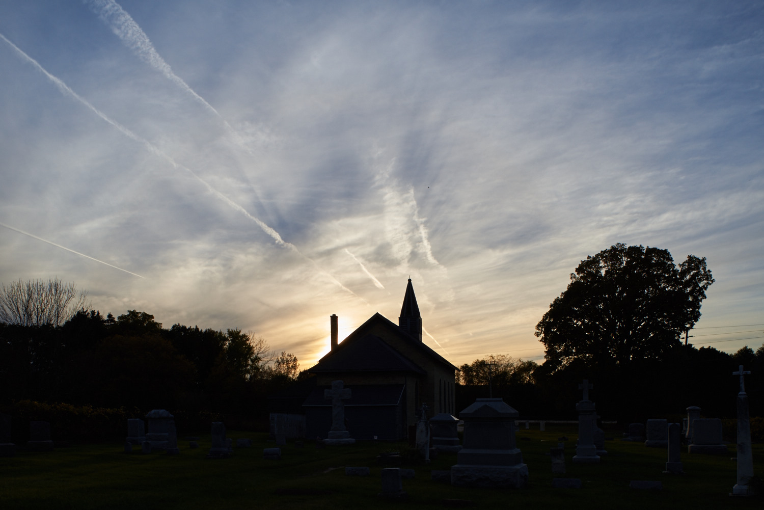
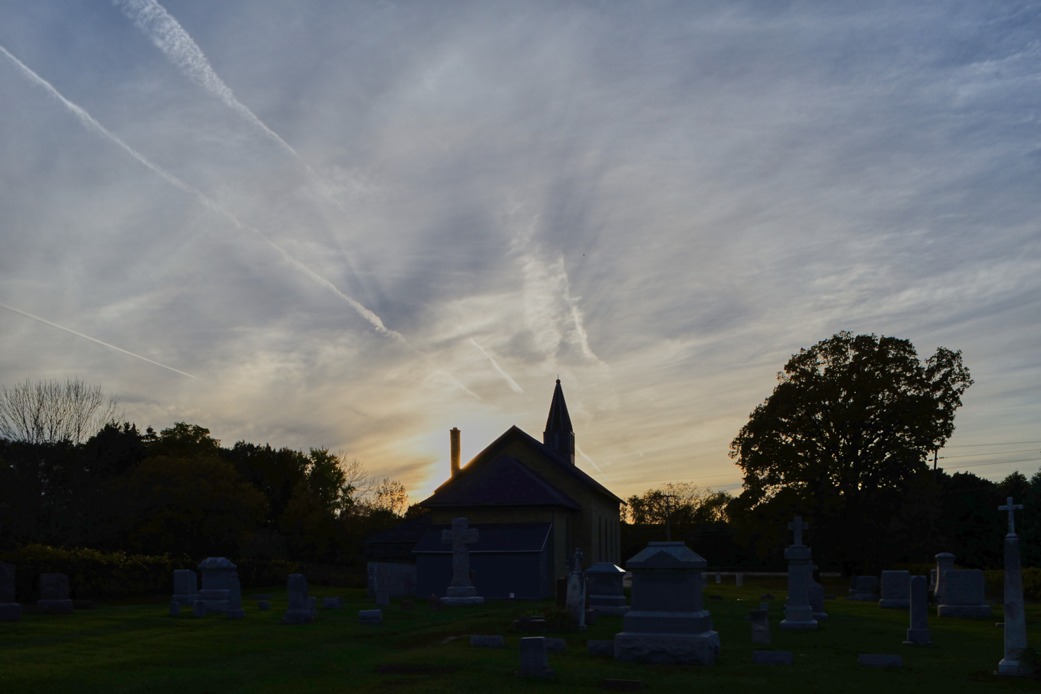
I used Highlight recovery to bring out more detail in the sky.
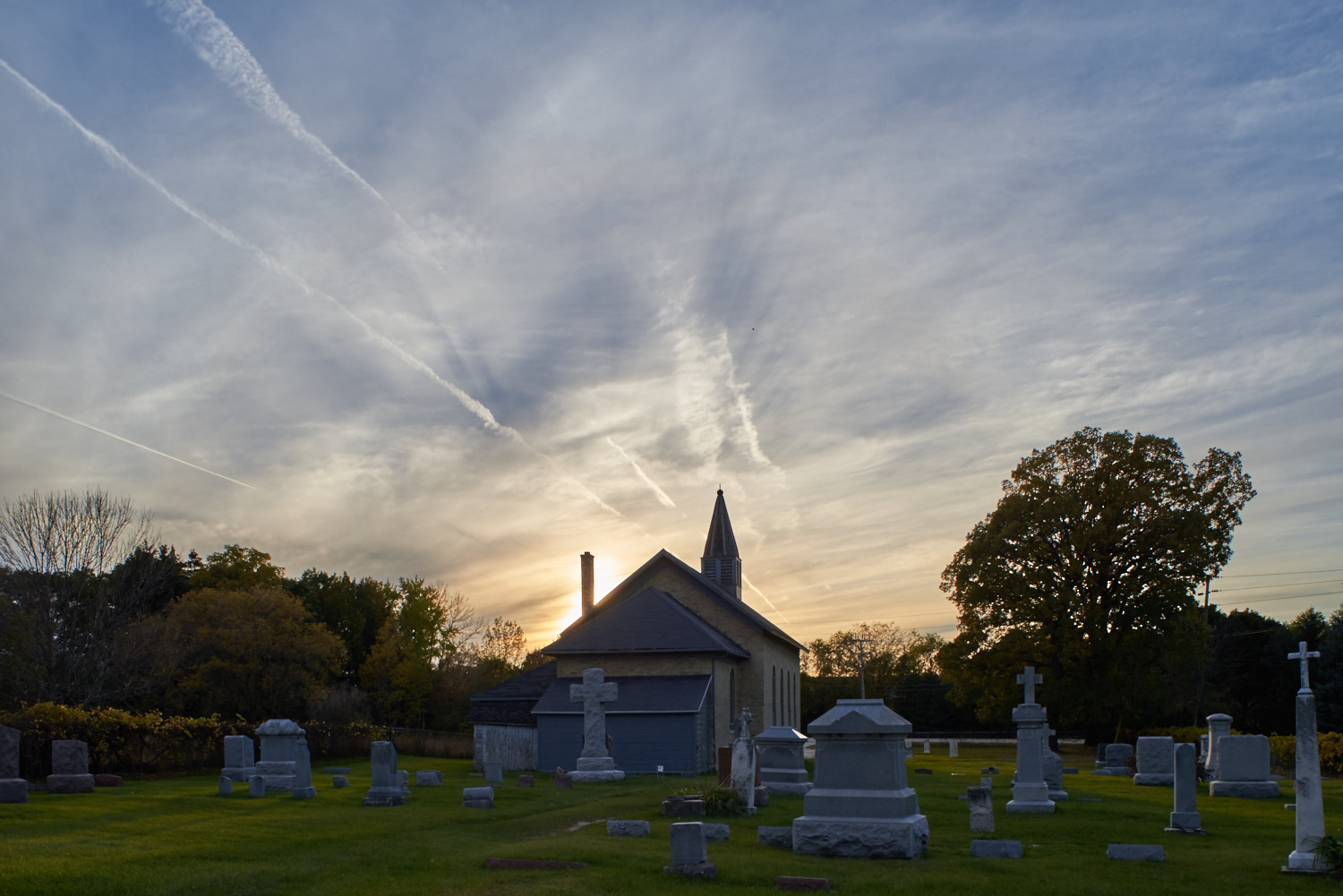
Using shadow recovery, we are able to bring a lot of detail into the foreground. In the original, almost everything below the skyline is black, with the shadow recovery, we have a lot of detail that was hidden before.
For a comparison, I created a highest quality JPEG with Nikon NX-D, using the vivid picture control, which is probably what I would have used for this image shooting JPEG. As is, it looks fine, pretty much the same as we got out of the default settings in Capture One.
But as we start to bring the shadow and highlight recovery in, you can see how much is missing in the shadows. The blown out area around the sun is also larger than edited RAW. This is with the same settings as the RAW, with highlight and shadow recovery both at 100.
I tried to replicate the results with curves, and that ended up with some more shadow detail, but killed the sky.
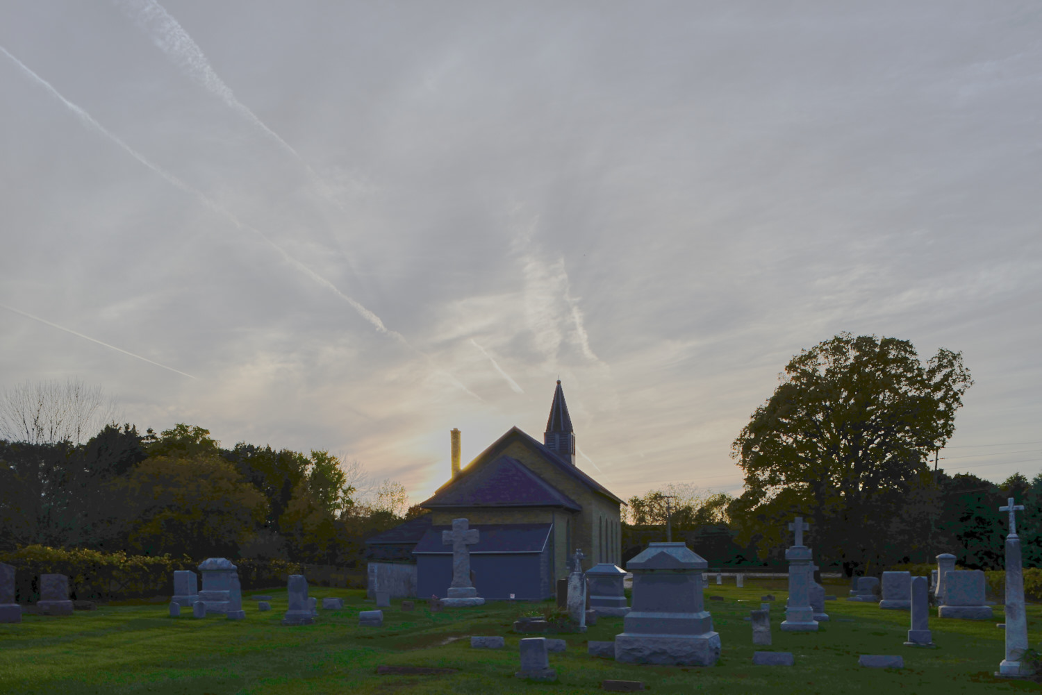
Here’s the final version of the RAW, with some punch clarity added. Some comparison points: the color in the sky, the chimney is “eaten away” by the blown highlight of the sun. You can also see fairly severe posterizing in the shadows on the JPEG edits at full size.

In this image, I might leave the foreground in silhouette anyways, but I wanted to demonstrate how you can squeeze a lot more dynamic range out of a photograph. For a scene like this, there really isn’t a “proper” exposure that would include the whole image. But with a few minutes of RAW editing you can have very good images with an extended dynamic range, without having to use HDR stacking techniques or the like. Using the dynamic range built into the RAW file avoids having to keep the camera still through multiple exposures and the problem of moving objects in an image. I have also run into situations where light washed into the darker areas of an image on stacked HDR that looked very unnatural. This, on the other hand, captures an image very like what I saw when I was standing there. Using JPEG, on the other hand, throws away a lot of image data that it deems unnecessary, and while some recovery is possible, it is much more limited.
Here is a little bit of the story of how I took the picture of the Blood Moon on 8 Oct 2014.

The eclipse was full around 5:30 – 6:30, and I happened to be awake at that time, so I headed over to the parking lot of a church near us, where I figured I could get a good view. I took the D610, and swapped between a Nikkor 70-300 4-5.6d and a Vivitar Series 1 600mm catadioptric (mirror) lens. The Vivtar is a fixed f8 aperture, and is pretty hard to focus when it is that dark out, so I did most of the shooting with the 70-300.
While I was out there, one of the people from the church came out to see what I was doing, since there was a random car in a back corner of the parking lot. Once he saw I was photographing the moon, he was really cool about it, and left me to it.
Listening to a Martin Bailey podcast recently, photographer David Kingham talked about the “500 rule” for shooting the night sky. Basically, the rule says that to avoid motion blur in celestial bodies, your maximum shutter speed should be 500/(your focal length), or in this case, 500/300, or less than 2 seconds. If I was shooting with my 28mm lens, I can drag the exposure out to 500/28, or about 17 seconds, before you start to get star trails. This image was right at 2 seconds, and did not seem to get the motion blur, but anything I shot longer than that quickly did. That also means that the 600mm lens has to have an exposure of less than 1 second at f8, which means pushing the ISOs really high.
This was set up on a tripod (I use a Manfrotto 190CXPRO4 4-Section Carbon Fiber Tripod with a ball head) and fired with a Nikon Wireless Remote
to minimize camera shake.
Once I had the images, I imported them into Capture One Pro 8, brought the white and black points in and added “punch” clarity to the image, and added some positive vignetting to correct the vignetting in the lens.
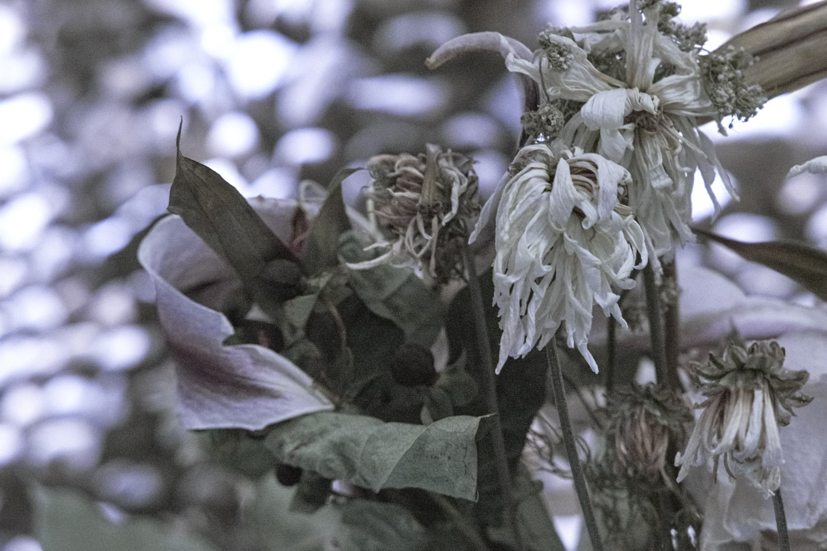
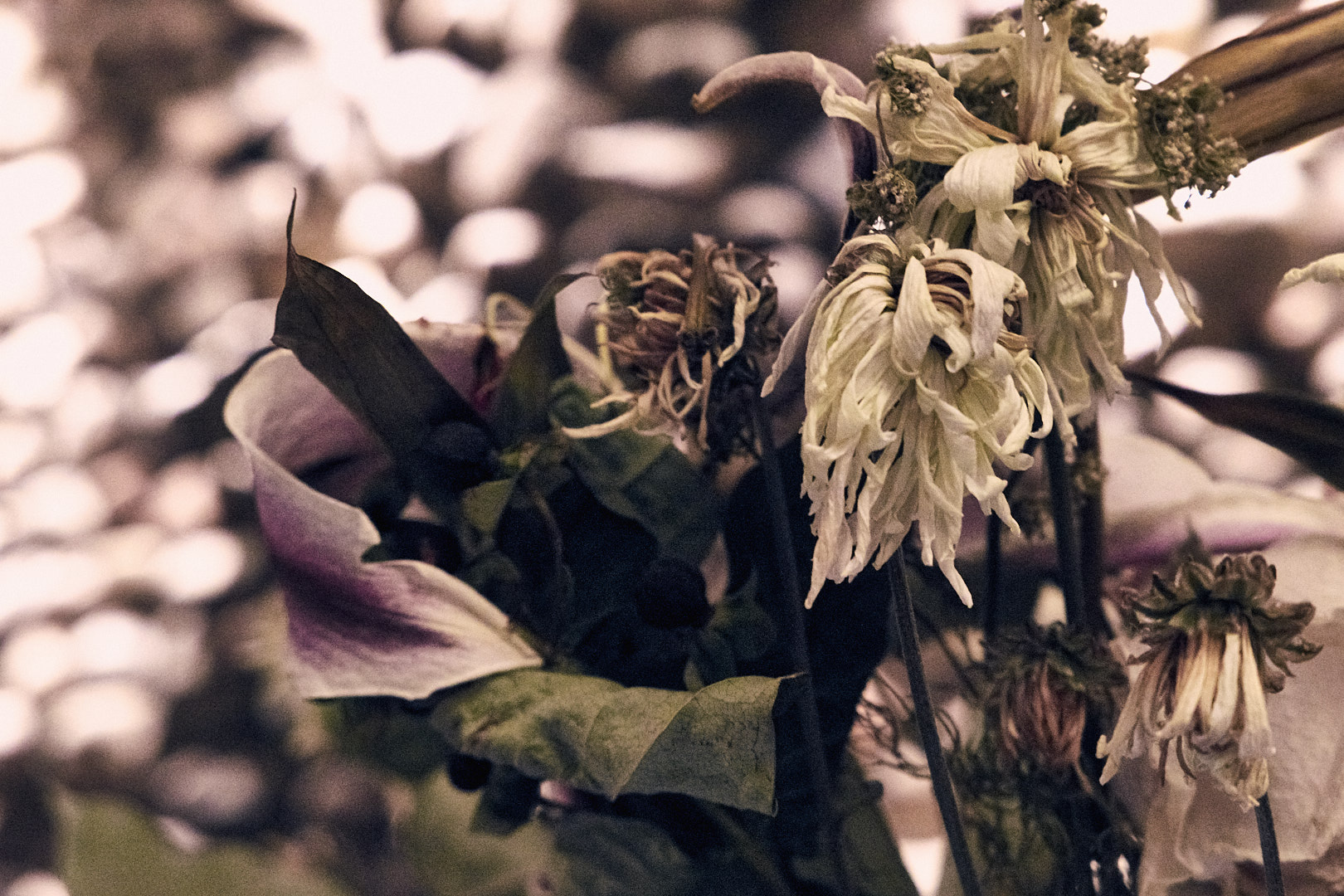
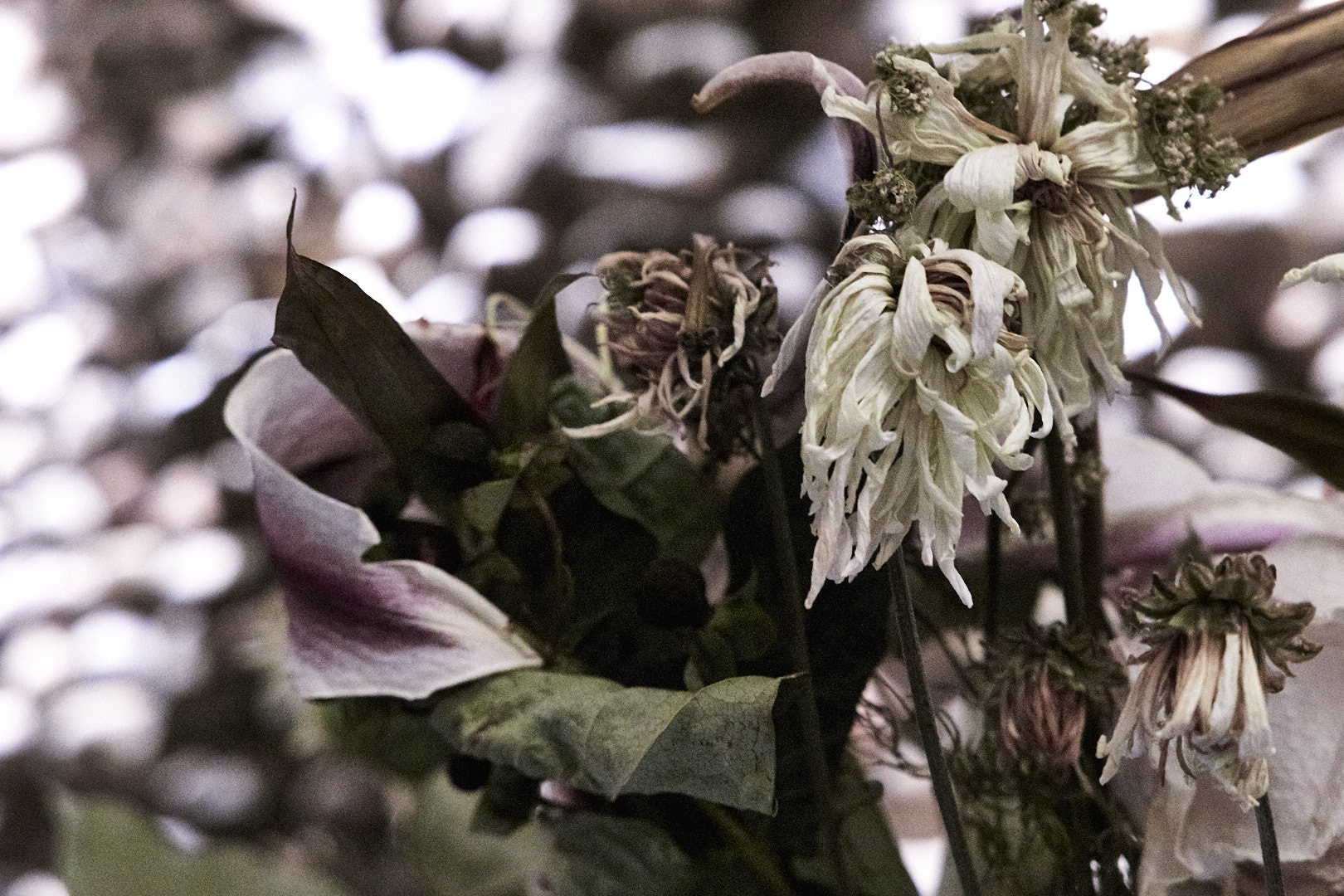
Phase One released version 8 of their Capture One software. I downloaded a copy, so let’s take a look at some of the new features, and some thoughts on the new version. This is a first impression, I reserve the right to amend my opinions with more time working with the software!
I don’t normally add grain to my images, but Capture One’s new film grain might tempt me to use it more. There are 6 options: fine, silver rich, soft, cubic, tabular, and harsh. The following are examples of each, 100% crop and 60% grain added. I like the fine and silver grain, it adds a little depth and character to the image without being overpowering. The others seem good, but would probably see less usage in my work.


Phase One added a Natural option to the clarity tool, which seems to mess with colors a lot less than punch, more in line with the classic and neutral options. Which one you use would depend on the image and the effect you are looking for. The images below are cropped to 100%, and have 60% clarity applied, more than you would with most images.


These add a lot of power for retouching images. This isn’t a Photoshop beater for the professional retoucher, but can probably let you avoid going to Photoshop for a lot of the lighter blemish removal type tasks. The clone layers are similar to the stamp tool in Photoshop, copying one part of the image to another. The Heal layers also work similar to the Photoshop healing brush, adding additional processing to blend the cloned area with the area you are covering.
The biggest limitation I see is that the relation from the healed spot to the area it is cloning from is fixed for each layer, and you are limited to ten layers. So if you take a sample a little below your fix, each spot you retouch will take a sample the same distance below the fix. So the layer might work great on the top of someone’s forehead, but lower down you would catch the eyebrows, necessitating another layer. This limits some of the larger retouching jobs, but it is an important feature, and executed pretty well.
Phase One also lists improvements in the processing engine, black and white processing, keyword tagging (more on that later), adjustment layers, scripting (Mac only) and other areas.
Keywords are defiantly better, but I want to be able to select a range of photos, type in a keyword, and have it apply to them all. As far as I was able to tell, it only applied to the first one. However, it is easier to copy and paste them, so there is that, which is nice.
No map-based geotagging like Lightroom. I don’t use it that much, but it is something I would like to do more of.
Hue sliders should show the colors, and they don’t. Edit: Fixed in 8.0.1
Could just be the images I tried it on, but the Incandescent white balance setting seems way too cool. Haven’t done extensive testing, though.
Vignetting still lags Lightroom by a significant amount. Not that big a deal in most of my work, though.
No Express version, except for one for Sony cameras. I have been using Express, and was planning to upgrade anyways, but it is hard to recommend a $300 piece of software to less serious photographers.
The subscription option is too expensive (in my humble opinion.) Subscriptions are $15/month, with in introductory offer of $10/month. So regular price is $180 a year, or buying the software +$60 every two years. Subscription pricing should be slightly less expensive than buying the software and upgrades, not 20% more, and that’s just the first version. If you figure a 2 year upgrade cycle, which is what C1 seems to be on, purchase the full version + 1 upgrade (4 years of current product) costs $400 ($300 for the initial full version, $100 upgrade,) 4 years of subscription (at $15/month) = $720. Even $10/month lands you at $480, and it gets worse the longer you run it. Adobe is offering Photoshop and Lightroom for $10/month, for about 2.5 times the original cost for software ($300 for C1, ~$750 for LR+PS). Not even counting the cost of upgrades, it takes over 6 years to equal the cost of buying it outright. I think $7-10/month would be more reasonable, with a $5 intro.
Film grain I would actually use.
The clone and healing layers will replace a lot, but not all, of my trips to Photoshop.
While the list of raves is shorter than the rants, it’s only because I am skipping the stuff that was already great, like B&W, highlight/shadow recovery, and (for me, anyways) a better user interface.
I am planning to purchase the upgrade (running the demo now) and probably remove Lightroom from most of my workflow.
All in all a solid upgrade to a great product.
Have you upgraded? What did you think? Please comment below.