Episode 7 of Four Edit Friday, a blacksmith at Old World Wisconsin.
Old World Wisconsin is a historical reenactment site, that features old houses and buildings from around Wisconsin, and hundreds of volunteers (and some employees.)
More software is going to a subscription model, which offers the benefits of a smaller up front cost and distributing the cost over multiple lower payments. The downsides are that there is a constant cost, and in most cases the cost of the subscription will overtake the cost of perpetual license and upgrades.
Want to waste less money, time, and effort in your outdoor shooting? Going places that don’t have the right views, wrong light, or the wrong angle of the light and you can wind up with sub-par shots, or missing them entirely. With this post, I will show you how to use some websites and apps to better plan location shoots, so you can better use your time and resources. Let’s take a look at the tools I used to plan this shot weeks before I actually took it. Continue reading “Digital Scouting”
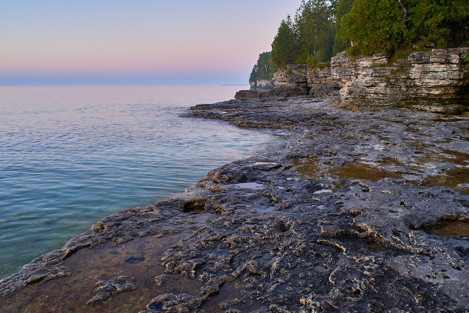
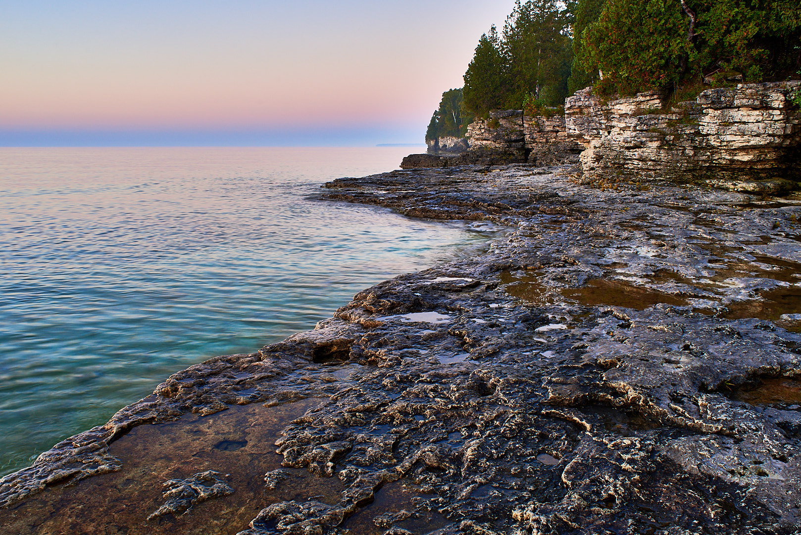
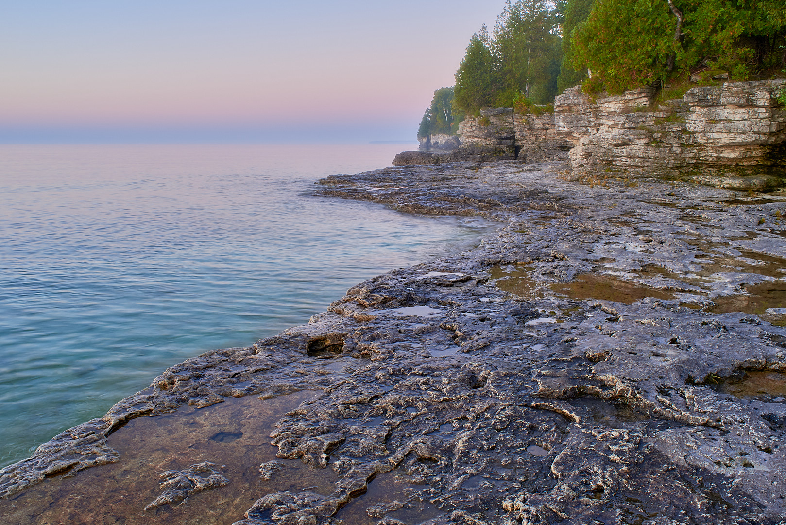
In this episode, we work on a picture I took at Cave Point County Park, in Door County, WI. As usual, the edits are done in Capture One Pro 10.
The initial edit is a standard edit
The second edit has exaggerated color and clarity.
Black and white. This is a higher contrast edit, which I prefer for this image.
Selective reduced clarity for a soft focus effect. The picture takes on a more dreamy quality with the softer focus and muted colors.
Which do you prefer? I think on this one I like the second photo. I would probably not use the soft focus effect much, but it is something interesting to play with.
Which do you prefer, or what would you have done differently? Please leave a comment below.
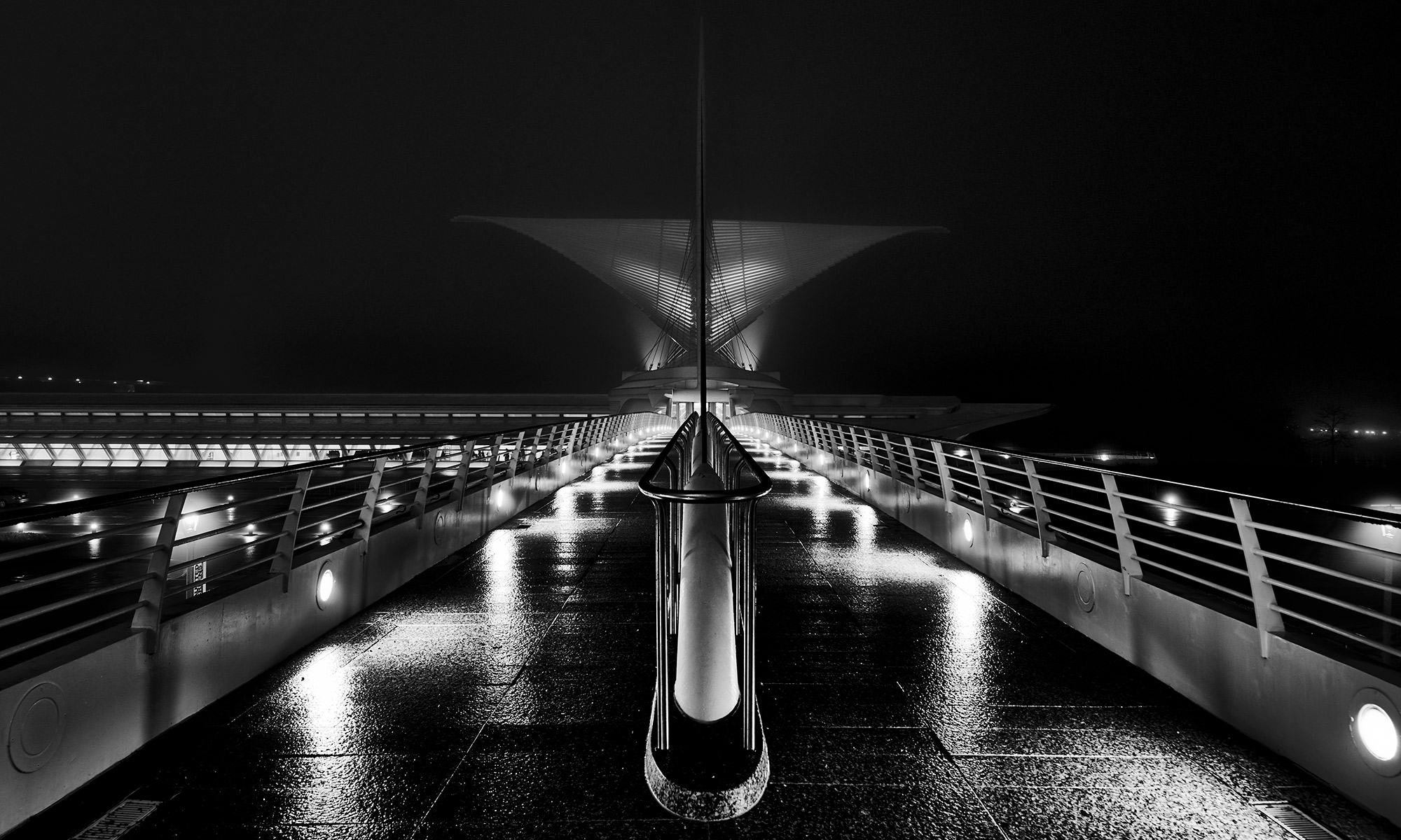
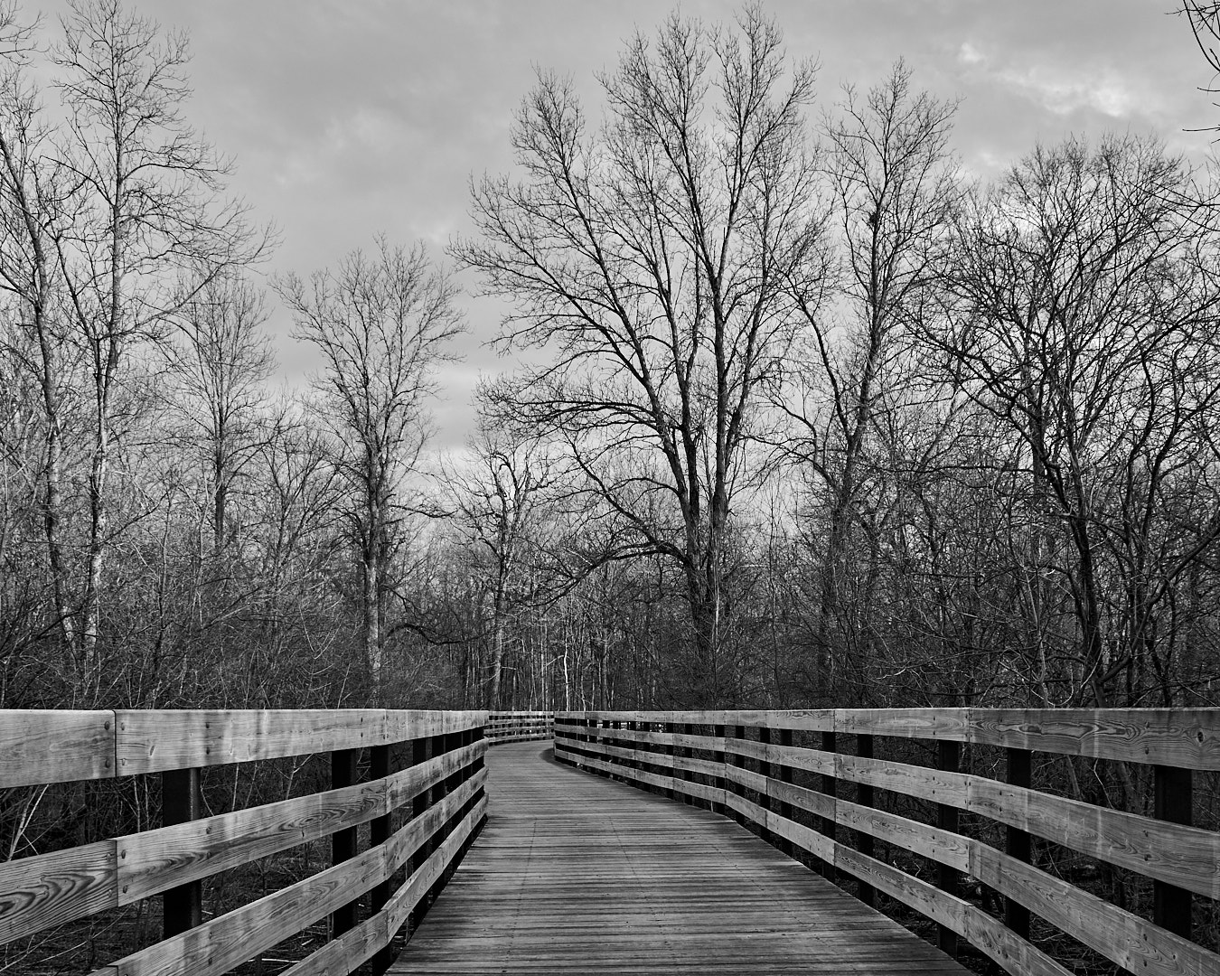
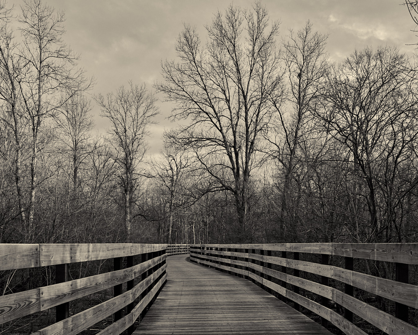
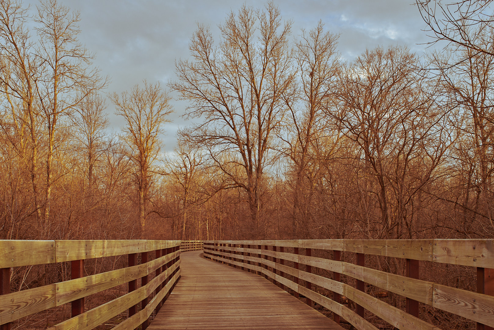
In this Four Edit Friday, we look at a picture of a foot bridge.
The first edit, as usual, is a fairly standard edit, mainly highlight recovery for the sky, and warming the color temperature. The photo is also cropped to 4×5, because I like that aspect ratio, and think it works for this image.
The second is a black and white, adding some contrast to the previous version.
The third one is just a sepia tone of the second, with a couple small tweaks.
The last one goes back to the original crop, and has some tone curve tweaks to give it an old film look.
I think I like the black and white edits, not sure whether I prefer the straight or toned version.
Which one do you like? Leave your thoughts in the comments.