After using Phase One’s Capture One for most of my photo editing, I have come up with a few tips to help get the best results. Hopefully these can help you, too.
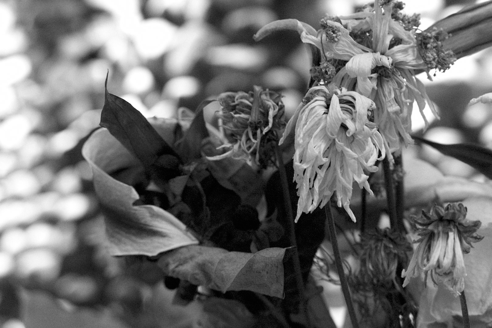
1: Setting Black and White points.
If you use Lightroom, or watch any tutorials, you have probably seen the tip to hold down the Alt/Option key while setting the white and black points. You can use the Exposure warnings in C1 the same way, but make sure that Shadow Warnings are enabled (Preferences > Exposure > “Enable Shadow Warnings” checkbox”).
I normally don’t use the warnings much, I start by setting the points to edge of the histogram, and adjusting by sight from there. When you are setting the black and white points, don’t be afraid to have some areas that are in warnings. The sun, specular highlights, and lights will often be entirely washed out, and will look wrong if they aren’t, and some shadow areas should probably wind up black.
2: Dodging and Burning.
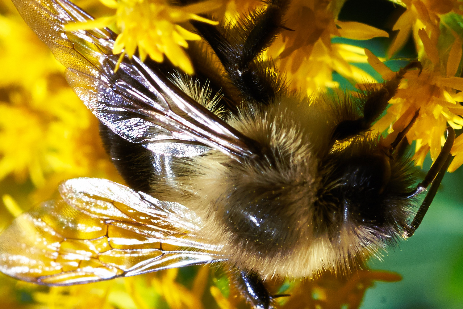
When using local adjustments to selectively lighten dark areas, or darken light areas, using highlight or shadow recovery can render more natural and pleasing results than using the exposure slider.
If the section is too far into the mid tones, or it does not work for some other reason, you can use the HDR tools to soften the effect.
3: Overdoing Effects
Ever need just a little more shadow recovery or something? Applying a selective adjustment mask to the whole picture allows you to add more of many maxed-out adjustments.
4: Customizing Your Tools.
This one isn’t really a secret, but C1 lets you create custom tool tabs. I have one that contains Base Characteristics, Rotation & Flip, Exposure, Levels, White Balance, High Dynamic Range, Clarity, Sharpening, and Black & White. I spend 90+% of my time in the browser tab and my custom one.
5: White balance in Black & White?
Yes! Adjusting the white balance in B&W photos can drastically alter the look. The white balance is applied before the B&W conversion, so adjusting it can act a lot like the sliders in the B&W tool to adjust the levels of individual colors. It is less predictable, but can sometimes make adjustments that are difficult with just the color sliders. Setting the white balance can also add separation for some colors, so I would recommend setting white balance before you do the B&W conversion in any case.
6: Try some non-conventional adjustments
Highlight recovery not looking quite right? Try lowering overall exposure, then using shadow recovery to lighten the shadows. There are a number of maybe counterintuitive things like this to try. It can seem weird, but like they say in audio “if is sounds (looks) right, it is right.”
7: Smoothing Colors
The skin tone color editor tool has additional tools to smooth out colors, however, the tool is by no means limited to skin tones. You can use it to smooth any tones in the image, and since it is available as a Local Adjustment, it can be applied to multiple tones in an image.
8: Enlarge tools
Some tools, like the Color Balance tool, can be difficult to use at the size it is on tool palate. If you click and drag the top of the tool off the palate, it becomes a floating window, and can be resized. Just drag it back onto the palate to dock it again.
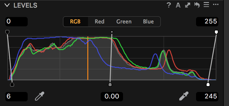
9: The many ways to adjust contrast
There are several ways to adjust contrast in an image, including the contrast slider, Levels tool, High Dynamic Range tools, curve tool, and even the Color Balance tool. Play around with them all, and learn their strengths and weaknesses.
Contrast: Very easy, but little control. Prior to version 9, it effected the saturation of the image too much to make very large adjustments. With the engine updates in 9, you can use it a lot more, but may need to add some saturation.
Levels: This sets your black and white points. I usually start by dragging the bottoms of the bars to the ends of the histogram, and a little past if it looks good. Once you pass the ends of the histogram, the image starts clipping.
High Dynamic Range: These only reduce contrast, but you can “overdo” some of the other tools, then soften it with the HDR tools.
Curve: The most control, and the easiest to mess up. An “S” increases contrast, the reverse can be used to bring out highlight or shadow detail. Use the Luma curve for less impact on saturation and color.
Color Balance: I haven’t used this much, but you can adjust the brightness of highlights, midtones, and shadows.
10: Selective saturation adjustments.
One of my biggest uses for the Color Editor is to tame the saturation of greens in an outdoor image. To do this, I increase the overall image saturation, then bring the greens down. You could also select the greens, invert the selection, and increase the contrast.
One thing to be aware of is that the overall saturation is applied before the Local Adjustments, so if you desaturated the image, you may not be able to add saturation back in.
I hope these give you some ideas to improve your editing.
Do you have any tips or tricks? Please leave them in the comments.
Phase One released version 8 of their Capture One software. I downloaded a copy, so let’s take a look at some of the new features, and some thoughts on the new version. This is a first impression, I reserve the right to amend my opinions with more time working with the software!
New and notable:
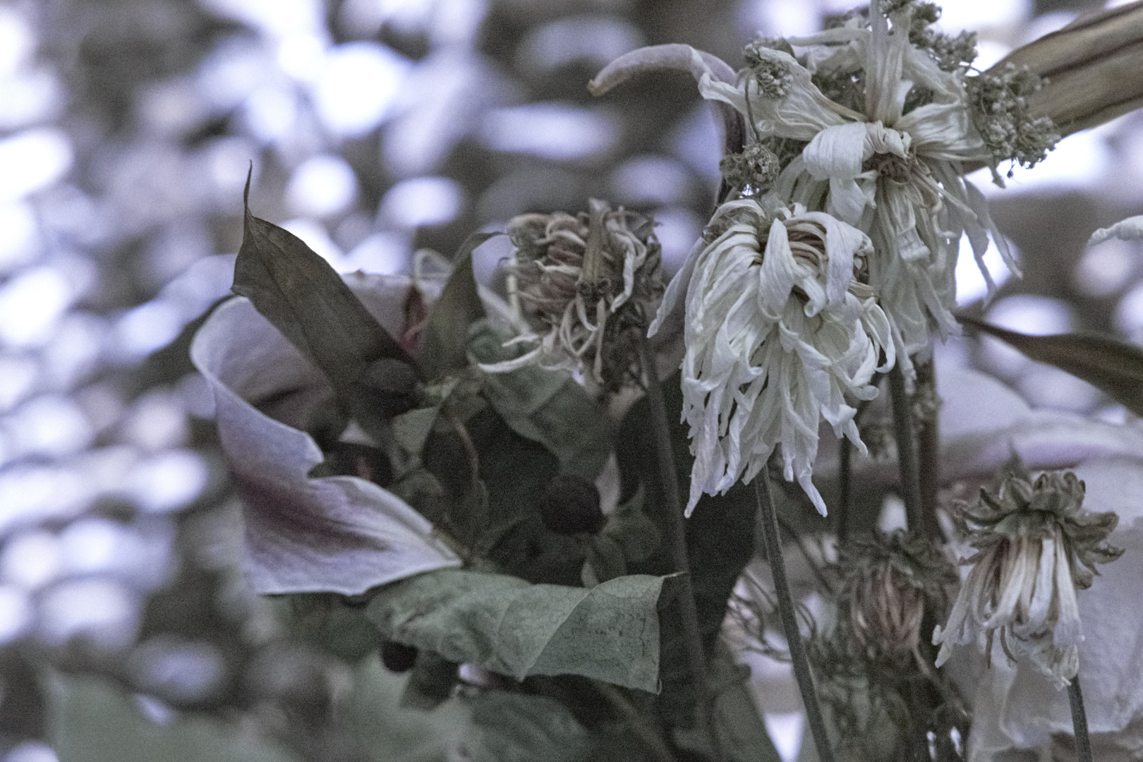
Film grain emulation
I don’t normally add grain to my images, but Capture One’s new film grain might tempt me to use it more. There are 6 options: fine, silver rich, soft, cubic, tabular, and harsh. The following are examples of each, 100% crop and 60% grain added. I like the fine and silver grain, it adds a little depth and character to the image without being overpowering. The others seem good, but would probably see less usage in my work.
Fine GrainSilver grainSoft grainCubic grainTabular grainHarsh grain
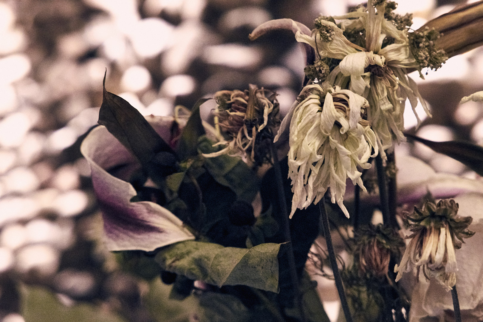
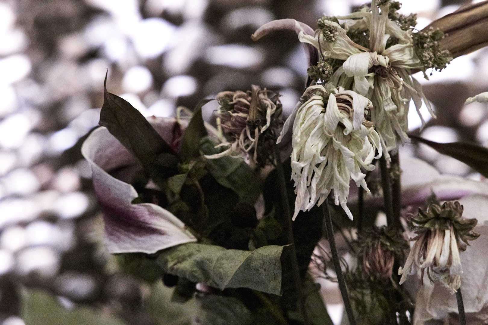
Clarity
Phase One added a Natural option to the clarity tool, which seems to mess with colors a lot less than punch, more in line with the classic and neutral options. Which one you use would depend on the image and the effect you are looking for. The images below are cropped to 100%, and have 60% clarity applied, more than you would with most images.
No Clarity EnhancementPunch ClarityClassic ClarityNatural ClarityNeutral Clarity
Clone and Heal Layers
These add a lot of power for retouching images. This isn’t a Photoshop beater for the professional retoucher, but can probably let you avoid going to Photoshop for a lot of the lighter blemish removal type tasks. The clone layers are similar to the stamp tool in Photoshop, copying one part of the image to another. The Heal layers also work similar to the Photoshop healing brush, adding additional processing to blend the cloned area with the area you are covering.
The biggest limitation I see is that the relation from the healed spot to the area it is cloning from is fixed for each layer, and you are limited to ten layers. So if you take a sample a little below your fix, each spot you retouch will take a sample the same distance below the fix. So the layer might work great on the top of someone’s forehead, but lower down you would catch the eyebrows, necessitating another layer. This limits some of the larger retouching jobs, but it is an important feature, and executed pretty well.
Also improved:
Phase One also lists improvements in the processing engine, black and white processing, keyword tagging (more on that later), adjustment layers, scripting (Mac only) and other areas.
Keywords are defiantly better, but I want to be able to select a range of photos, type in a keyword, and have it apply to them all. As far as I was able to tell, it only applied to the first one. However, it is easier to copy and paste them, so there is that, which is nice.
Rants:
No map-based geotagging like Lightroom. I don’t use it that much, but it is something I would like to do more of.
Hue sliders should show the colors, and they don’t.Edit: Fixed in 8.0.1
Could just be the images I tried it on, but the Incandescent white balance setting seems way too cool. Haven’t done extensive testing, though.
Vignetting still lags Lightroom by a significant amount. Not that big a deal in most of my work, though.
No Express version, except for one for Sony cameras. I have been using Express, and was planning to upgrade anyways, but it is hard to recommend a $300 piece of software to less serious photographers.
The subscription option is too expensive (in my humble opinion.) Subscriptions are $15/month, with in introductory offer of $10/month. So regular price is $180 a year, or buying the software +$60 every two years. Subscription pricing should be slightly less expensive than buying the software and upgrades, not 20% more, and that’s just the first version. If you figure a 2 year upgrade cycle, which is what C1 seems to be on, purchase the full version + 1 upgrade (4 years of current product) costs $400 ($300 for the initial full version, $100 upgrade,) 4 years of subscription (at $15/month) = $720. Even $10/month lands you at $480, and it gets worse the longer you run it. Adobe is offering Photoshop and Lightroom for $10/month, for about 2.5 times the original cost for software ($300 for C1, ~$750 for LR+PS). Not even counting the cost of upgrades, it takes over 6 years to equal the cost of buying it outright. I think $7-10/month would be more reasonable, with a $5 intro.
Raves:
Film grain I would actually use.
The clone and healing layers will replace a lot, but not all, of my trips to Photoshop.
Summary:
While the list of raves is shorter than the rants, it’s only because I am skipping the stuff that was already great, like B&W, highlight/shadow recovery, and (for me, anyways) a better user interface.
I am planning to purchase the upgrade (running the demo now) and probably remove Lightroom from most of my workflow.
All in all a solid upgrade to a great product.
Have you upgraded? What did you think? Please comment below.