Was Apple Right About Right to Repair?

Probably not. I think being able to repair things is very important, although I am not as caught up in being able to perform the repairs myself. Apple’s lack of repairability and upgrade options have long been a sore spot in what is otherwise one of my favorite product lines. But in light of the recent reaction to the Self Service Repair Program, I can better understand some of their reticence.

The news on repairability from Cupertino has been a decidedly mixed bag lately. First, we get reports of improvements in the way batteries are mounted in the new MacBooks, making them easier to replace than previous versions. Then we get the Mac Studio with the screws hidden under an adhesive ring, and while the drives are physically replaceable, they appear to be locked to a system in a way that makes upgrades and even replacements difficult to impossible. The M1 architecture inherently limits memory upgrades but brings enough benefits to justify that. Drive capacity is another matter, as we see in the physically separate (and at least physically replaceable) drives in the Mac Studio.

When Apple announced the Self Service Repair Program, there was some reasonable skepticism. Now that we get to see what that program looks like, there continue to be criticisms, some more justified than others.

One of the most common complaints I am seeing is that the self-service repairs are not noticeably cheaper than bringing the device into the Apple Store to perform the repair. Given Apple’s reputation, it is easy to assume they are price gouging on the replacement parts. Still, comparing them to iFixIt, we find that Apple is selling at generally competitive rates, especially when considering the rebate for returning the originals.

PartiFixItApplewith refund
12 Pro Max Battery$39.99$69.99$44.85
12 Pro Max Seals$6.99$1.80/twoN/A
12 OLED Screen$244.99$267.96$234.36
12 Camera$39.99$111.75$59.25

Prices are for the single part only, not the repair kits, as those are difficult to compare directly. The camera module is quite a bit more expensive if you don’t return the original part. I assume that is to encourage returning a module that probably has more opportunities to refurbish, so it is more valuable to get back. For the rest, the screen is actually cheaper if you send in your old one, the seals are a lot less expensive, and the battery only costs about 10% more, which is in line with what I would have expected for any OEM parts.

The other way to look at the pricing is that Apple is clearly not price gouging on performing the repairs in-house. Obviously, this is more beneficial if you are near an Apple store, but it is an important point.

The other common complaint is that the tools Apple rents are just ridiculous, coming in two large Pelican cases. Sure, it seems overkill, but this has to be the first time I have heard people claiming that things would be easier without the right tools. And if you think you can do better with a blow drier and guitar pick, go right ahead. You have to check a box to say you have the appropriate tools and experience to perform the repairs, but there is nothing to force you to use Apple’s tools.

On top of that, the $50 rental fee can’t be much more than the shipping cost, meaning Apple effectively provides them for free; you only pay for shipping. You can also buy the tools if you are in a situation where that makes sense, such as an IT shop in larger organizations.

Some people say the manuals should cover repairs that do not use the official Apple tools, but there are too many variations for that. It is unreasonable to expect Apple to foresee all the tools, heating elements, etc. that people may use. If you can’t work out the adjustments to your own tools, you shouldn’t be attempting the repair.

The program certainly isn’t perfect. Requiring the serial number of the device you are repairing before ordering parts makes it impossible for independent repair shops or even IT organizations to keep spare parts in stock. Also, the process of pairing the device to the phone seems to be excessive. You should be able to go to a website or run a program instead of having to call in. There have also been some reports of problems with people getting billed for not returning the tools, but those seem to have been fairly quickly addressed. Hopefully, Apple will rectify that issue soon, and there will be some way for shops to keep at least some parts in stock.

The final accusation I would like to examine is that the phones shouldn’t be that hard to repair. I easily replaced the screen on an iPhone 6; there is no crazy adhesive to remove or anything like that. But that phone didn’t have any level of waterproofing, and many more people benefit from a waterproof phone than will benefit from repairs being a little easier, especially when Apple will do the repairs for not much more than the cost of parts.

The accusation that the Self Service Repair Program is Apple doing the minimum is laughable. They offer the official parts, manuals, and tools at competitive prices. They make the tools available for rental at a VERY reasonable price and for purchase if you think you will get the value out of them. And you can always use your tools if you feel you can do the repairs better that way.

Doing the minimum would have been blatantly overpriced parts, no tools, and basic instructions. Instead, we have what appears to me to be about the best Apple can do to make sure that the repairs can be completed in a way that ensures high quality and the highest likelihood that the device is as good as it would have been had Apple done the repair.

It has been fascinating watching so many people who claimed they wanted this effectively go, “It’s too hard!” And in that, Apple is in a place to say, “I told you so.”

Considering all of this, would you use Apple’s Self Service Repair Program? Let me know in the comments.

Platypod Extreme Review, Even Better Than Before

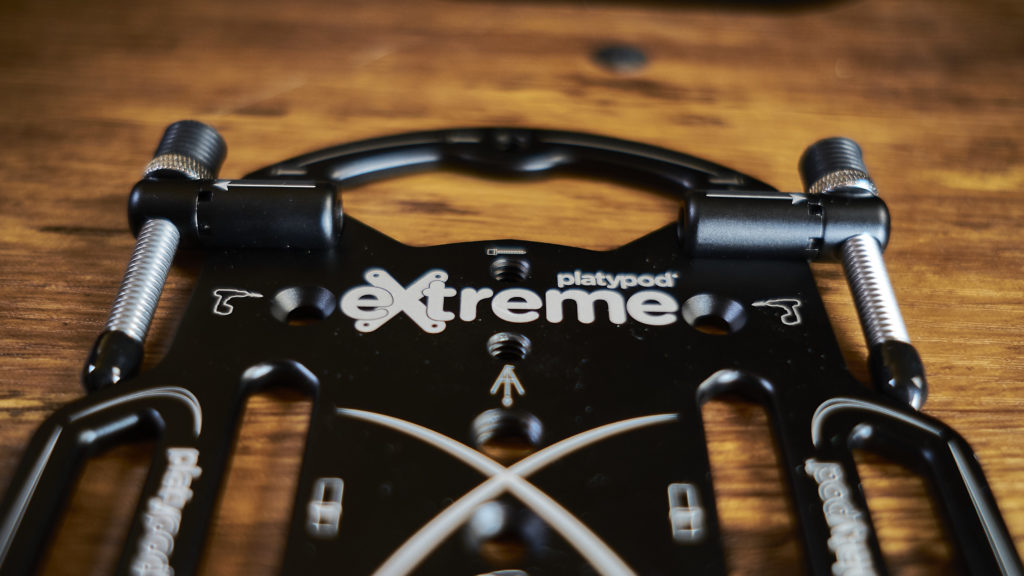
The new Platypod Extreme

As someone with a bit of a camera support system addiction, I have used Platypods for years. If you haven’t seen them before, these deceptively simple devices are a plate you mount a tripod head to for low shots, and they can be placed or mounted via screws or straps on something for other points of view. For transparency, I paid for this at the launch on Kickstarter.

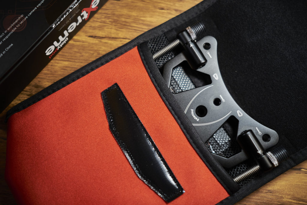
The Extreme Comes with a neoprene case and carabiner

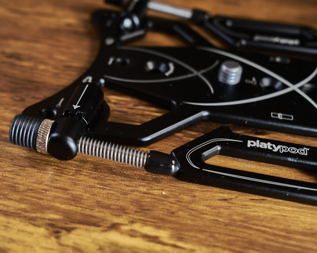
I already own a Platypod Pro and Max, which are great, but I saw one area for improvement: the feet are really fiddly to use and can slow you down. So when Platypod announced the Platypod Extreme, I was happy to see that they addressed this with a clever rotating mount design. The feet are the same screws used on the Max but set in a rotating mount at each corner. The feet can rotate to five different positions; stowed, straight down, angled slightly forward or back, and at a backward angle roughly opposite the stowed angle.

The rotating mounts for the feet.

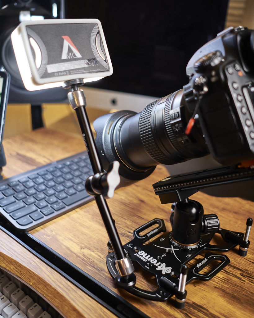
There are threaded holes for mounting the feet in other positions or to mount things like goosenecks or magic arms to hold lights, etc. I’ve used magic arms for lights and used them to mount GoPros or phones. There are also four countersunk holes for wood screws for a more permanent mount.

The 1/4 20 holes are also useful for mounting accessories.

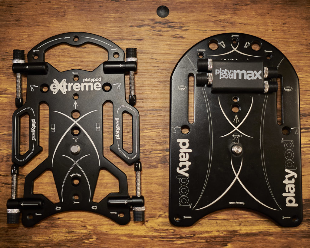
The Extreme is about the same footprint as the MAX, actually, a little bit narrower. The feet are set as wide as the Max in the back, and wider in the front. Front to back, the feet are mounted a little closer than the Max. The strap mount is also open from the sides so it can be attached faster than the closed slots on the MAX. This all adds up to a significant update to the larger Platypod platform.

Size comparison with the Platypod Max.

The Platypods are an excellent option for many photographic situations, from tabletop to landscapes, cities, travel, etc. The Extreme is still in pre-order from platypod.com. You can also get the other Platypods on Amazon or Adorama (affiliate links). 

Four Cross-Platform Apps I Can’t Live Without

The Mac and iPad work well together, but some apps take that to the next level. Here are four cross-platform apps that I use all the time. Although this list started with an iPad/Mac list, most include Windows versions, and some include Android.

We will be looking at apps used to create and edit files or otherwise sync data like to-do lists, not things like weather apps that just display information.

Why cross-platform apps? The different platforms each have their strengths. For instance, it is great to be able to open a photo on the iPad to edit with the Pencil. Using the same files between the different platforms simplifies this considerably.

I am back to having a laptop (the excellent 14″ MacBook Pro), but for a while, I was primarily using an iMac, and the iPad was my mobile solution, so without some of these apps, I working between the two would have been much more difficult. And sometimes, I just prefer grabbing the iPad instead of the MacBook.

Some apps also have phone apps, so if an idea for a blog post hits away from the computer, I can pull up iA Writer and get started. While the iPhone is not my preferred writing platform, it is great to be able to capture those ideas while they are fresh.

What makes for an excellent cross-platform app?

  • Full file compatibility, so a file created on one platform works on the other and back again. Apps like Garage Band for iOS allow the project to be imported on the Mac, but there is no clear path back, which would not qualify.
  • Near or full feature parity. As much as possible, both platforms should support the same features, and any missing features should not impair file compatibility. An excellent example of a feature that is not shared across platforms is the name generator in the desktop version of Scrivener, but not the mobile version. The feature does not impair the file compatibility in any way.
  • Optimized for each platform. Developers can basically check a box to deploy iPad apps to the Mac, but this often leads to a suboptimal Mac app.
  • iCloud (or other cloud) sync. You should be able to save the file on one device and open it on the other immediately or even have it open on both.

Affinity Suite ($54.99 desktop, $21.99 iPad per app)

Affinity Photo and Designer are solid alternatives to Adobe Photoshop and Illustrator, respectively. They have iPad and desktop apps with full file compatibility and nearly full feature parity. Photo and Designer are available for Mac, Windows, and iPad. No Android or iPhone versions are available as of the time of writing.

In addition to Photo and Designer, Affinity also makes Publisher a solid option for desktop publishing. Publisher is currently only available for Mac and Windows, but an iPad version has been teased.

While the Affinity apps are not quite drop-in replacements for Adobe yet, they are compelling options, especially at the price.

iA Writer ($29.99, all platforms)

iA Writer is a very clean markdown editor, and what I used to write this. It is not as full-featured as some; for instance, there are no blogging plugins, but it has a great set of features for writing and even has an iPhone version.

iA Writer saves files as plain text files to its own folder, which gives you a catalog of files. You can add hashtags to the files, then either choose the hashtags or create Smart Folders based on them. This takes a little getting used to but offers a great deal of flexibility. I usually tag files with #wip for work in progress, changing it to #ready when it is done, and #published when it has been posted to my blog and Medium.

Using the hashtags allows you to “move” the files without creating multiple versions and breaking recent file opening, like moving them between folders.

There are quick links to add the various formatting marks for markdown, and some handy features, like creating filling the link if there is a URL in the clipboard when you click the link button.

LastPass (Free app, $3-4/Month for Pro and Family plans, affiliate link)

While I usually don’t like subscriptions, I make some exceptions for programs that provide external services. While Apple Keychain does an excellent job of basic password management, LastPass adds some important features. The most obvious is that it supports Windows and Android. The other big one for me is the Family plan, which allows folders to be shared between family members. Passwords in shared folders can be accessed by family members, with permissions configurable for full, read-only, or no access, so passwords for banks can be shared between parents, and entertainment and education passwords can be shared with children. Passwords that are not in the shared folders are not shared with any family members, so you can maintain security within the family, as well. You can also assign someone who can request your password database after your death.

LastPass also includes security checkups, looking for passwords used across multiple accounts and passwords exposed in data breaches. Password history and a configurable password generator also make managing passwords easier.

Microsoft Office

While the iWork apps are a great option at an unbeatable price, I have run into enough limitations, especially in Numbers/Excel, that I use Office. I am also more used to the Office apps because I use them in my day job.

Office is also the standard when collaborating with others, and while there is decent file compatibility with some of the other options, using Office is the cleanest when sharing files.

Not only are there Mac, Windows, and iOS apps available, but the files can be edited on the web.

Honorable mentions

These apps are great, but for whatever reason don’t make it into my “every day” list.

Scrivener ($49 for Mac, $20 for iOS)

Scrivener is better suited for long-form writing and has a great feature set for writing a novel or screenplay, but it can be used for anything. Since I am mainly doing short-form writing, I tend towards iA Writer, but Scrivener’s layout is fantastic for longer-form work.

iWork (Free for Mac owners)

While I use Office for most of my work, iWork is a great option. This does not have a Windows version; however, like Office, it has the option to edit files on iCloud.com, so you can work on files on your gaming rig or other Windows box.

Vectornator (Free)

I landed on Affinity Designer, mainly because of the rest of the Affinity Suite, but Vectornator has some great benefits, especially being free. It also has an iPhone version, although I usually find the iPhone too small for heavy vector drawing, even on the Pro Max.

In Conclusion

These are some of my favorite cross-platform apps; what are yours? Join the conversation in the comments, and follow me for more articles on photography and the creative life.

When to Use Each Exposure Mode (Even P!)

One of the confusing things for new photographers is the different exposure modes. What do P, S (or TV), A (or AV), and M mean, and when should you use them? And what about those icons? When would you use one vs. another? And why do cameras have “P” when every third photography tutorial seems to be about getting out of it? Let’s break it down, so you can always choose the proper mode.

Why Exposure Modes Matter

Exposure is composed of three things (well, there is a fourth, but for this we will focus on three) aperture, shutter speed, and ISO. Feel free to skip to the next section if this is old hat, but if you are not familiar:

Shutter speed

Shutter speed is how long the shutter is open; the longer it is open, the more light is allowed in, and the more motion blur you can get in the image. Shutter speeds are expressed in fractions of a second, up through seconds. Each full stop is double the time of the previous one, although there are some jumps where this is not quite followed, so one stop from 1/250th is 1/125th, while the next stop is 1/60th.

Aperture

Also called the f-stop, the aperture is a mechanism that closes down part of the lens. The smaller the aperture (the larger the f-number) the less light is allowed in, and the more depth of field (the area in acceptable focus) you get. Portraits often use a small f-number aperture to blur the background, while landscapes usually use a higher f-number to get the whole image in focus.

ISO

ISO is the relative sensitivity of the sensor to light. The higher the number, the brighter the image, but usually at the cost of noise and a reduced dynamic range (the difference between highlights and shadow where usable detail is recorded).

What the Exposure Modes Mean

Each mode gives you a varying level of control over the image. In P, or Program, the camera picks both aperture and shutter speed (and ISO if Auto ISO is enabled). In A, or AV mode, the photographer chooses the aperture, and the camera fills in the appropriate shutter speed. S, or TV (Time Value) allows the photographer to select the shutter speed, and the camera fills in the aperture. M requires setting both. The photographer can set the ISO, or if Auto ISO is enabled, the camera balances the ISO with the other exposure factors.

Subject Specific Modes

Some cameras have modes for portraits, landscapes, sports, etc. These are all extensions of P, but favor things like a shallow depth of field for portraits or faster shutter speeds for sports.

When to use M

Most tutorials seem to favor M, but in my experience, it is not the one most people shoot in. Being comfortable shooting in M is valuable, but don’t feel it is the only serious option or “how all the pros shoot.” Manual mode gives you the most control and is best when you are in control of the lighting, when there is something tricky, like a lot of contrast between foreground and background, and when using manual flash.

Any time you are using manual flashes, either speed lights or studio lighting, you will need to shoot in manual, since the camera cannot meter the flashes.

You can also enable Auto ISO, which gives you automatic exposure with full control of shutter speed and aperture but make sure ISO is not getting too high or low. This is a good way to shoot for video, so the look does not change drastically in the middle of a clip.

When to use S (or TV)

Shutter priority (Time Value in Canon speak) is best when you need to maintain a minimum shutter speed, like to freeze the action in sports or wildlife photography, or want to use a longer shutter speed to create intentional motion blur. Just remember that the aperture range is going to be smaller than the shutter speed range, so you generally need to keep a little closer eye on your ISO (or enable Auto ISO) than when using A or P modes.

When to use A (or AV)

From my own experience and from talking to and reading others, aperture priority (aperture value to Canon users) seems to be the preferred mode most of the time for most serious photographers. My cameras are in A most of the time. It is generally safer than shutter priority since there is a much wider range of shutter speeds, and controlling depth of field is generally the priority. A is suitable for most situations, but especially for subjects like portraits or landscapes where you want extra control over depth of field.

No one uses P, right?

Since it seems like most photography tutorials focus on getting you out of P, it is natural to wonder why it is on cameras in the first place, and especially high-end, professional cameras. The reality is there are times where P is the right choice.

DSLR/mirrorless photography can be overwhelming when you start, and leaving the camera in P allows new photographers to focus on composition and how they see the world. Yes, we want to learn to use the other modes, but it is easier to let the camera take care of exposure when you start. Unless you are going for specific looks right away, leave your camera in P while you get the other pieces worked out.

OK, I hear you say, but no PRO uses P, right? While it isn’t as common as the other modes, there are some situations where it is appropriate, like times where conditions are changing rapidly, and capturing the moment is more important than the specific look of the picture. These times include events, news, and (I’m sure this will be controversial, but) weddings. Joe Buissink, a wedding photographer with a client list (and day rate) that almost anyone would envy, always keeps the camera in P, because he wants to make sure he gets the moment, and when you are moving between very bright and very dark settings in a wedding venue, P keeps up with it better than anything else. Please don’t take this to mean you can leave it in P Mode with no thought. Watching further in the video, he is doing plenty to control the exposure but can always fall back to P when something comes up suddenly.

Specialty Modes

Some cameras have special modes like Sport, Portrait, landscape, etc. These are extensions of P, but weigh the settings towards the most common settings like high shutter speeds for sports, more depth of field for landscapes, and less for portraits. These can be useful when learning or in the other situations where you might use P.

Where to go from here

It is valuable to know how and when to use all the modes available on your camera. Once you learn to use them, they are all useful tools in your toolkit.

No single mode is perfect for everyone in every situation, and all the modes can get good results in many situations, but there are times when certain modes work better. Learn your camera and the modes it supports well, and don’t get too caught up in anyone’s opinion of how you should shoot.

Now, get out there and create something beautiful.

Male Northern Cardinal

When I started taking bird photos, the cardinals were strangely elusive, somehow always staying just far enough back that I couldn’t get a decent picture. Since then, I bought a ground blind (affiliate link), which allowed me to get even closer. The next thing was to get a cardinal in a snowstorm, which I had the chance to do this week.

My Thoughts on the MacBook Pro 14-Inch

Having just bought the new MacBook Pro 14-inch (M1 Max, 24 core GPU, 32 Gigs, 2 TB), I have to say it is great to have a machine that feels like Apple made it for creators and pros, not Jony Ive’s design sense. Don’t get me wrong, I love (most of) his iconic designs for Apple over the years, but there are times where it felt like the design overtook the user requirements. Things have gone the other way in the new design, with the ultra-slim-looking tapers gone and most of the ports back. All these go to what pro users need, and after the initial impression that the new MacBooks are enormous (they are not, it is just that the full thickness goes to the edges instead of tapering), the design still looks great. The look harks back to the earlier unibody MacBooks, or even further to the G4 Titanium PowerBooks and iBooks, which I am old enough to remember wanting. OK, OK, I remember when the original G3 iMac and iBook were the hot things.

After several years of laptops that did not feel like there was much “Pro” about them, these are refreshingly designed to address the issues that pros have had with the MacBook Pros in recent years. The keyboard feels great, the HDMI and SD Card slots cut the need for dongles and readers, and everything seems ready to get stuff done.

Why I bought one

First off, I’m a Mac user. I edit in Final Cut and Motion, develop for iOS, and feel more comfortable in macOS than Windows or Linux. After a couple of years on an iMac, I also missed the mobility of a laptop, whether traveling, just getting a change of scenery, or working when I am away from my desk. I have been enjoying getting away from my desk, whether it is just to the living room or out to coffee shops. Also, it is finally possible to get a laptop that has the power to do everything most desktops can, and better yet, get it in the smaller size, not just the larger 15 or 16-inch models.

What I Like

The size.

My first Mac was a 13-inch Retina MacBook Pro, and while I loved the form factor, the power was not there. The new Pros have plenty of power for everything I want to do. Even the 13-inch Pro covers what most people do for most business, creative, and programming uses. Adding the M1 Pro or Max means you have the horsepower to do just about anything, in a form factor that is easily carried even in smaller carry-on bags (and my 13-inch camera bags). For everything I have done, it is on par with or (almost always) better than my well-equipped 2019 27-inch iMac.

The Build.

The new MacBooks feel like they are made for professionals. Professional is a somewhat loaded term, and plenty of people who are not classical professionals will use this. But if you are someone who relies on your computer to get stuff done, create, do business, etc., it feels like (with a few minor exceptions) they were thinking of you.

The screen is beautiful, especially when you throw HDR content at it. The 14-inch size is a nice improvement from the 13-inch.

The camera, keyboard, and speakers are all great. Since everyone uses these things all the time, it is pretty important to get them right, and Apple did. Things like the new TouchID sensor are also nice touches.

The SD card slot.

Even with higher tier cameras (Nikon D850, D500, Z50) in the house, they all support SD Cards, and having a reader built-in makes it much easier to work on the road, at events, and while I am not at my desk.

The return of MagSafe.

I was as appalled as anyone when USB-C replaced MagSafe. The design is just so good, with the significantly lower risk of dropping your laptop or even breaking the power port with an errant bump or tug. Then I got used to the convenience of USB-C, sharing power adapters with other things, access to third-party chargers, and charging from either side of the computer. When I heard the rumors of MagSafe returning, I was actually kind of torn, thinking I would be missing out on those benefits. However, the new implementation is truly the best of all worlds. You can use MagSafe most of the time, but if you are stuck with just a USB-C charger, it still works. The cord is detachable from the charger, so it works with third-party USB-C chargers, and you only need to replace the cable if something goes wrong. The new MagSafe is as close to a perfect solution as I have seen in quite a while. The only improvement I would like to see is the cord going from $50 to $20.

What I Don’t Like

Not a whole lot here. I have seen a couple of times when it got hot, and I wonder if it is too tuned to keep the fans low. It would be nice to easily tweak them to spin up a little more in some cases.

The price.

This one would not be an issue if the M1 didn’t exist. Even as expensive as they are, the Pro and Max represent plenty of value. In the pre-Apple Silicon days, my wife and I were pricing new MacBooks. Each one would have cost almost what it cost us to get both a 13-inch M1 for her AND the 14-inch for me. This was due to the higher memory, discrete GPU, etc., and it would have required the 16-inch since the power wasn’t available in the 13-inch.

Looking at it another way, Apple has compared the M1 Max’s video editing capabilities to a Mac Pro with the 28 Core CPU and an Afterburner card. To put this in perspective, for the price of just those upgrades, you could buy a MacBook Pro with everything except storage maxed out and have enough money left over to buy a second one. And that doesn’t even factor in the cost of the Mac Pro; that is solely the CPU upgrade ($7000) and afterburner card ($2000). By the time you include the price of the Mac Pro, you could buy 3 to 4 well-equipped MacBook Pros.

For anyone who needs the power, the new MacBook Pro represents exceptional value. So why is price a problem? As I said before, because the M1 exists. Even the M1 MacBook Air is so powerful that it will do everything most people need to do at half the price. So consider what you need from your computer and if you need to spend the additional money for the M1 Pro or Max.

One last port.

OK, I’ll be that guy. I wish there was one USB-A port. While plenty of stuff has moved on, some things are still USB-A, and oddly, many are pro-level equipment. Wireless adapters for many mice, presentation controllers, and graphics tablets are still USB-A, as are hardware licensers like the iLok and most multi-factor authentication hardware. You can use dongles, but especially for the wireless adapters that can usually be left plugged into a USB-A port, it is not an ideal situation.

Other Thoughts

The Notch. Some people loath it, some defend it, and some, like me, accept it as an annoying compromise that makes sense. It takes up a part of the screen that is usually not used to move the title bar up and provide a higher-quality webcam. These days, with the prevalence of video conferencing, webcams are a vital consideration. It could be smaller, but I am guessing (hoping?) they left space so they could add FaceID later without expanding it. Having used it for a few weeks, you usually are not looking at that part of the screen anyway, so it has not been a problem. I have seen a few reports of menus disappearing behind it, but apps do pretty well wrapping around it from what I have seen. (Based on Capture One Pro, Affinity Photo, and Xcode)

The Removal of the TouchBar.

Like the notch, I am somewhat ambivalent about the TouchBar. I don’t think it was a bad idea, but with no support for desktop keyboards, even the ones from Apple, developers had less incentive to invest in optimizing for the TouchBar, and it languished. So I don’t feel like we are losing much here, and the function keys are more stable and less likely to be inadvertently pressed.

HDMI 2.0 and UHS-II

I’ve seen some complaints about the HDMI and SD Card not supporting the newest, highest-speed versions of the protocols. UHS-III would be nice, but not much supports it now. HDMI 2.0 supports up through 4K60, and for the vast majority of uses cases, this will be completely fine. I think Apple targeted this much more for ad-hoc use, like conference rooms, shared workspaces, and so forth, that are usually not more than 4K60. Most high-end monitors will be USB-C/Thunderbolt anyways, so while the newest and fastest would always be nice, I don’t think either will be that much of a limitation in real-world use.

Battery life:

It is good, but, especially with the Max SoC, you aren’t going to get 17 hours out of it most of the time. This isn’t surprising; the battery life numbers are based on some pretty specific workloads (which Apple lists) that maximize battery life. So while I have found battery life to be very good, there have been times where I had to plug in a bit sooner than I would have expected.

No Bootcamp/Windows virtualization support:

This isn’t a problem for what I am using this computer for, but I also use a MacBook for my day job, and it may be an issue there. Hopefully, Microsoft will allow for properly licensed ARM-based Windows, but until then, there will be a bunch of Intels that are kept alive just for that purpose.

In conclusion:

If the new MacBook Pros indicate where Macs are going, the next several years will be good. They are very capable and have been designed to address the needs of people who use them to get stuff done. Almost everything users have been asking for has been addressed, and most of it is done very well. I am very happy with mine, and I am looking forward to what is coming in the future.

How about you? Have you bought one, or is it on the shopping list?

Does the new 14″ MacBook Fit in 13″ Bags?

Any time the dimensions of a device change, one if the questions is whether the existing accessories like bags or cases will still fit. I recently bought a 14″ MacBook Pro, and since I own a Think Tank BackStory 13 (which I received as a review product) I was wondering if the new MacBook would fit. While the 14″ MacBooks are a little larger than the current 13″ MacBooks, they are very close to the dimensions of the earlier Retina MacBooks, so they fit many of the bags for 13″ laptops. I have a few different ThinkTank bags, and managed to check a couple others at a local camera shop. Here is what I found:

Any of the 15″ bags should have plenty of space. The 14″ MacBook is closer in size to 13″ computers than 15″, so it fits in any of the 15″ bags I’ve tested (The MindShift BackLight 26, Retrospective 30 shoulder bag, and Retrospective Backpack 15)

BackStory 13: It fits snuggly without stretching anything. I have managed to barely fit an 11″ iPad Pro, as well, but that is getting very tight, especially with the Magic Keyboard.

Retrospective 7: The computer fits and the bag closes fine, but the computer is a bit taller than the laptop sleeve. I would use it, but the computer is maybe a little larger than planned.

Vision 13: Nothing special to note here, the MacBook fits great.

PhotoCross and Urban Access 13: I was not able to confirm these, but the size listed is similar to the Vision 13, so I would expect it to fit in either of these.

Let me know in the comments if you have tried any others, or have different experience with any of these.

Use this link when buying from Think Tank, and receive a free gift with qualifying purchase of $50 or more. (This is an affiliate link, if you purchase using it I will receive a commission)

New Gear – Tether Tools ONsite Relay For Continuous Power

Sometimes we need to run cameras longer than the stock batteries allow for. Time lapses and shooting video are just some of the activities that can benefit from a continuous power source. Most camera manufacturers have a way to provide external power to the camera, but there are drawbacks to these systems that the Tether Tools ONSite relay (formerly/also called the Case Relay) address.

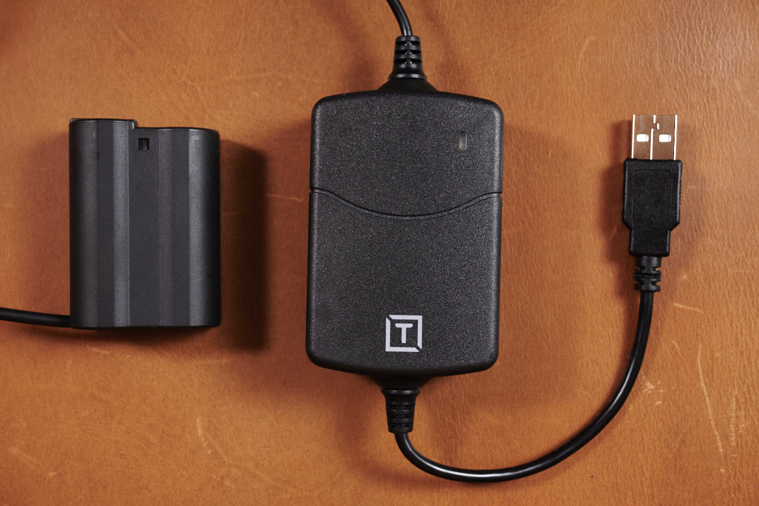
For most of the systems, there are two parts, a power supply and a battery adapter. The adapter fits into the battery compartment of the camera, and provides the correct interface between the camera and the power supply. Tether Tools provides both parts of the system, although some camera systems require the use of the OEM battery adapter (check tethertools.com for compatibility information.) If you have multiple cameras, check them all to see if any have special requirements. My Nikon D610 is listed as working with the Tether Tools battery adapter, while the D850 needs the official Nikon one.

The main advantage to the ONsite system is in the power supply. Instead of being locked to a specific plug type, it uses a USB connection, so anything that provides a 5 Volt, 2 – 2.4 Amp power, including wall chargers and power banks, will work to power it. Even better, the adapter includes a battery, allowing it to be moved between power sources. For example you can switch to a new power bank without interrupting the camera. This also eliminates the concern over a power interruption, since the battery will keep the camera running for quite a while. The battery is 1200 milliamp hours, making it about two thirds the size of a stock Nikon EN-EL15 (original, a, and b at 1900 milliamp hours, or a little over half an EN-EL15C at 2280 milliamp hours.)

The OEM Nikon battery adapter and Case Relay power supply

What I like:

  • Provides constant power for video or time lapse.
  • Internal battery to to move to a fresh power bank and protects against power fluctuations.
  • USB input for maximum flexibility

What could be improved:

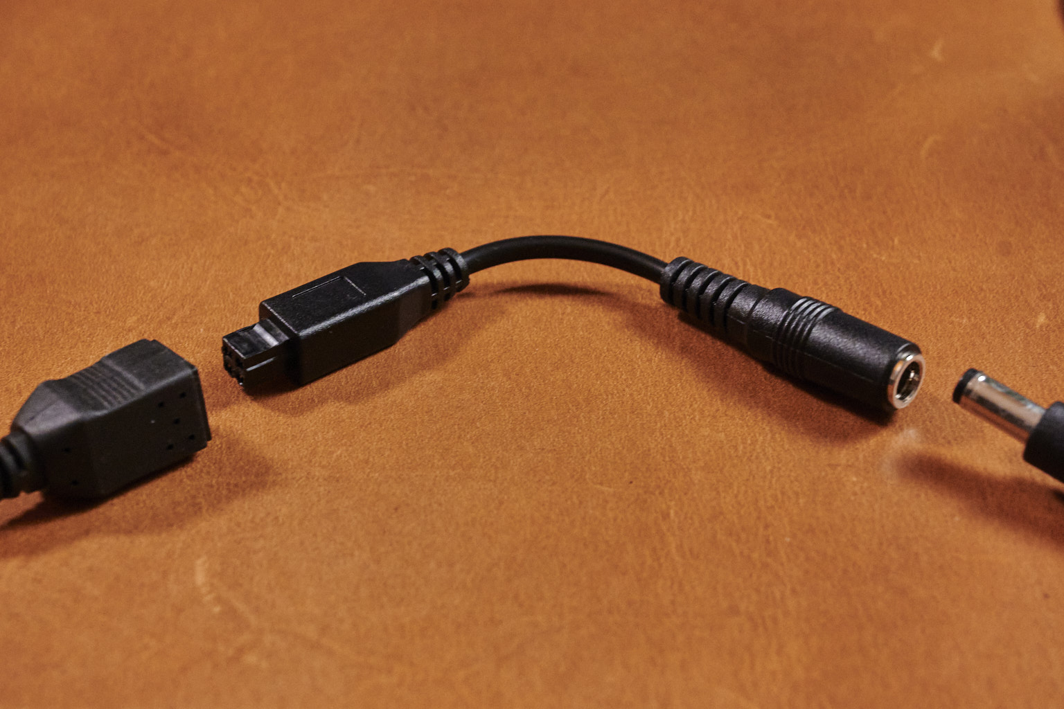
  • To work with Nikon and Canon OEM battery adapters, an additional adapter cable is required. I would prefer the whole camera-side cable could be replaced with a compatible one.
  • The power level of the on-board battery is only visible as a 3-color LED, it would be nice to have something a little more detailed, such as a 5-LED strip.
Adapter for the Nikon OEM Battery adapter.

Other notes:

  • The cables are rather short. This makes sense for using power banks, but you will probably need an extension if you plan to use AC power adapters. You can get a camera-side cable from Tether Tools, any standard male to female USB extension for power side, or an AC extension cord. I prefer the shorter cables, since it makes it easier to keep cables organized.
  • Make sure to check compatibility for your camera. There are some instances where specific cameras need the OEM battery adapter and others can use the Tether Tools version. If you are looking at a new Nikon or Canon camera, you probably want to err on the side of ordering the OEM adapter.

You Might Need One if:

  • You do time lapses that run up against battery limits.
  • You shoot a lot of video.
  • You use a video rig that makes it hard to access the battery.
  • You shoot weddings or other events and frequently have to change batteries.
  • You have a camera set up for YouTube, streaming, or the like that stays in one place.
  • You shoot in the cold. Not only can you use a larger power bank, it could be kept insulated or even warmed to maintain power.

You can buy one at:

Amazon*
Adorama*
Or Tethertools.com

Overall, this is a strong product, and the integrated battery is a great idea. If you are looking for a constant power system, I would recommend this over the standard manufacturer adapters.

Do you use constant power? What are your use cases? Let me know in the comments.

Looking for more gear information? Check out my post on whether high-end memory cards are really worth it.

* Affiliate links, if you purchase from this link I get a commission

Keeping track of Lensbaby Data

For anyone used to EXIF data, it can be frustrating not having lens and F-stop data from Lensbaby lenses. You can take notes, for instance in the Lensbaby Field Guide, which is great for the purpose, but taking notes can be cumbersome in the field.

My first version of lens tracking was to take a picture of the lens/optic before putting it on the camera, which gets you the information on the lens you are using but can be a little problematic since you might not have the opportunity to, or you can easily forget to, take the image before putting the lens on, and you do not get f-stop data.

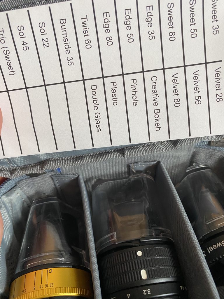
My latest version is a card (well, a folded piece of paper) that lists the current (and some out of production) lenses and optics on one side, and the F-stops on the other. At any point, you can take a picture of the card with your thumb on the appropriate lens and flip it over for the f-stop (if you want to record that.) Once you import the images to your editor, you can tag them with the appropriate information (most will not let you edit the EXIF data, so I just use keywords) and delete the photos if you want.

Indicate the lens you are using, and flip the card over for the f-stop

Here is a PDF of the card, feel free to print and use it. The blank spaces can be used to add other lenses or other data you would like to add. Fold the page into thirds along the long lines first, then fold it in half. In this format it also fits perfectly in the top of my favorite case for Optic Swap optics:

The GP-2 Kit Case from the MindShift Gear Gear Pouch Bundle – Small or Medium bundles is perfect for three optics and the card (Purchase from Think Tank with this link and get a free gift with a qualifying purchase of $50 or more. Affiliate link.)

Do you have any tips you would like to share? Drop them in the comments below, and remember to use discount code WHOLDMANN at Lensbaby.com for 10% off.