In this Four Edit Friday, we look at a picture of a foot bridge.
The first edit, as usual, is a fairly standard edit, mainly highlight recovery for the sky, and warming the color temperature. The photo is also cropped to 4×5, because I like that aspect ratio, and think it works for this image.
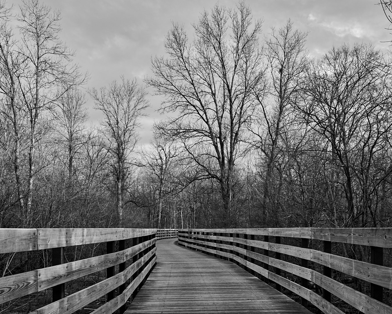
The second is a black and white, adding some contrast to the previous version.
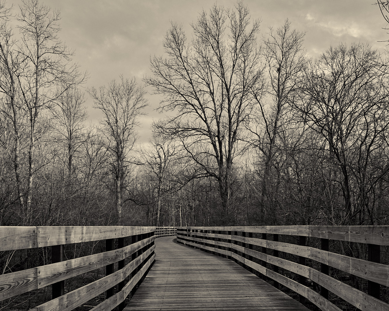
The third one is just a sepia tone of the second, with a couple small tweaks.
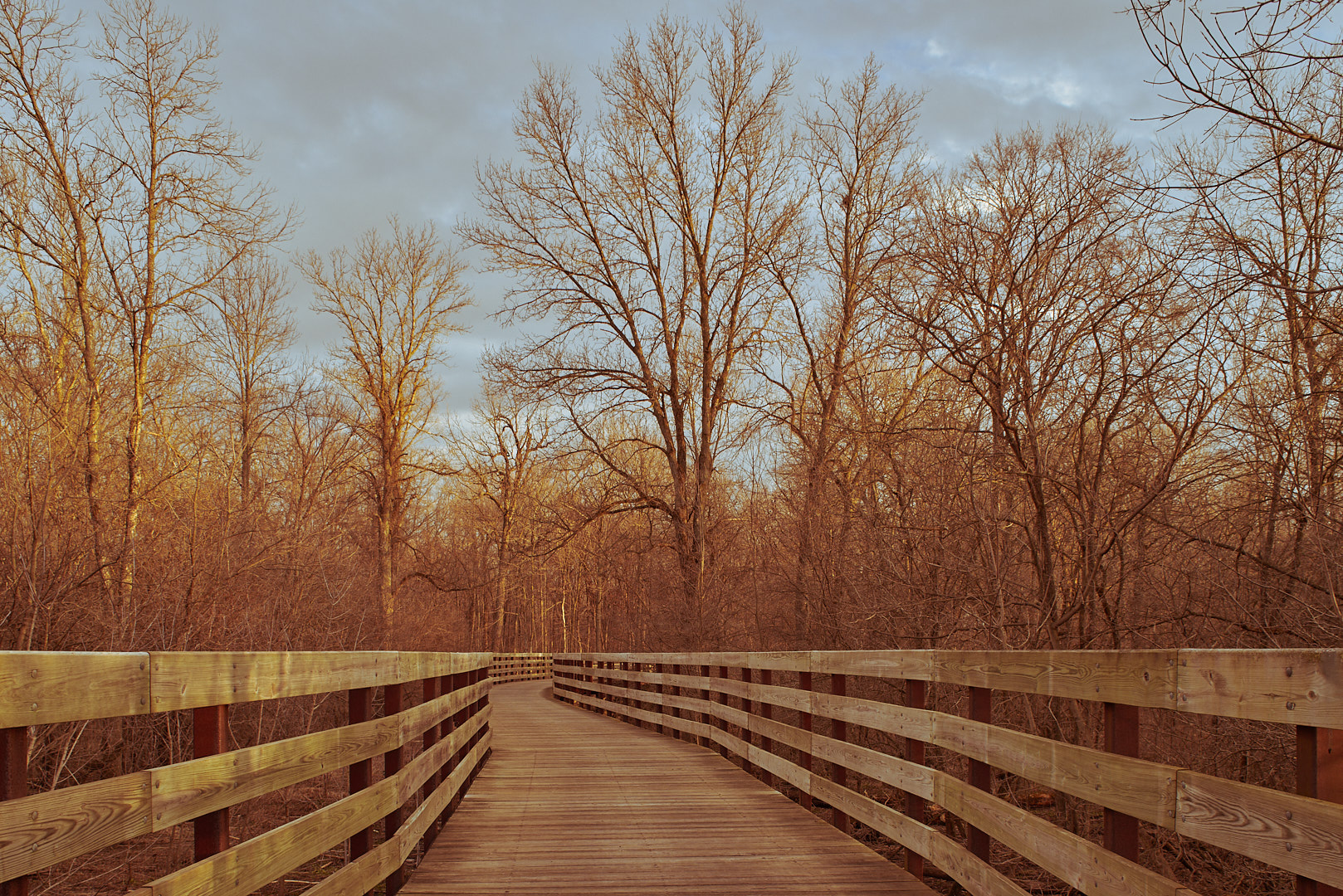
The last one goes back to the original crop, and has some tone curve tweaks to give it an old film look.
I think I like the black and white edits, not sure whether I prefer the straight or toned version.
Which one do you like? Leave your thoughts in the comments.


